INSIDE THE PINK HOUSE
SECTION PERSPECTIVE WORKFLOW
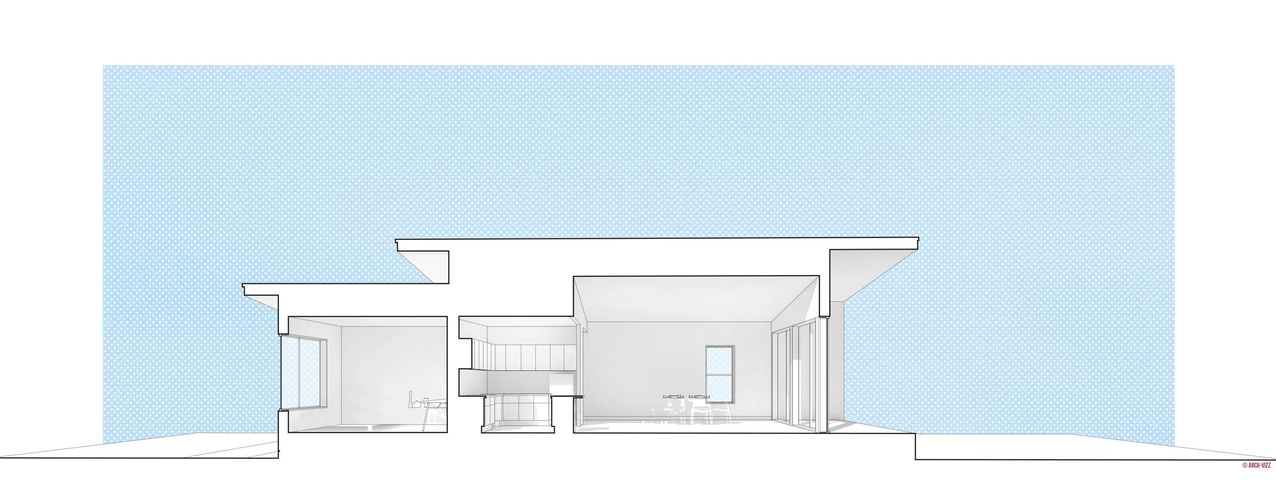
For this workflow, we'll take a look at how to create a "collage looking drawing". This style has become very popular in the Architecture field, since it speaks more to the essence and idea behind the project, and leaves some room for people's imagination. You may apply it to perspectives, plans, diagrams, etc. For this tutorial, I'll be using a section perspective exported from Rhino with very a simple geometry and no materials, and adding all details in Photoshop. Here it is:
1 | PHOTOSHOP WORKFLOW
A | base image
From Rhino, I rendered a very simple white base for this section. Afterwards, I added a dark section cut, filled with a white tone to help frame the image.
B | sky texture
To add a nice soft background to the image, I combined a blue tone with a dotted pattern for the sky. Make sure the scale of the dotted pattern isn't too big, so it doesn't distract from the rest of the image.
Write here…
C | Textures
The key to collage images like this lies in the textures. The more detail your textures have, the more it'll add to each space. For that reason, don't be afraid of combining multiple textures to create new ones!
For the walls and grass, I've combined textured images from Architectures with fun 2D geometries from Sublte Patterns .
There are many websites where you can find fun textures. Go to our Resources page to find out more.
Bedroom Texture
Living Room Texture
Grass texture
Kitchen Cabinets Texture
D | LANDSCAPE
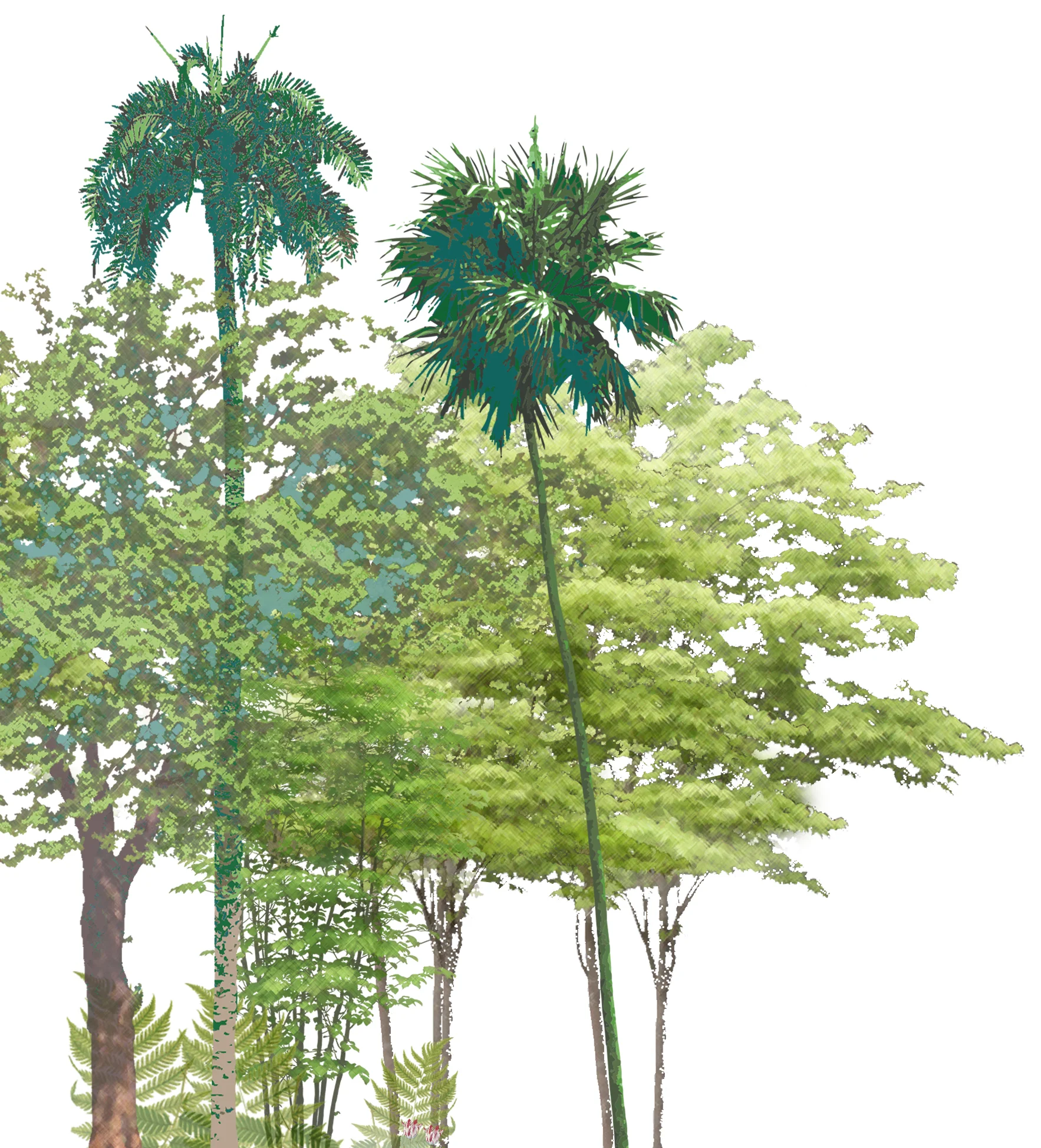
After composing the landscape, I applied a filter in Photoshop called "Dry Brush" (under Filter Gallery), to give it a drawing-like effect.
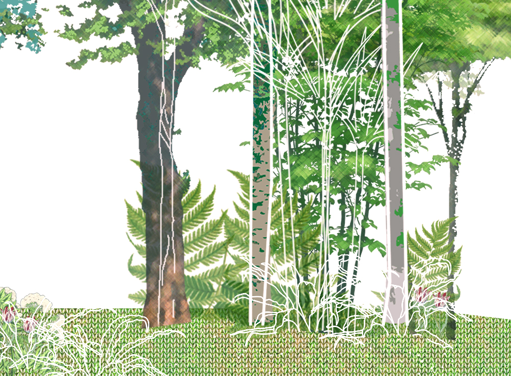
Then, using a white brush, I drew over some of the trees, adding a white outline for more texture. I also added a few 2D trees in white to soften the landscape.
Landscape after filter
Landscape with white line details
Landscape after filter
Landscape with white line details
E INTERIOR DETAILS
This is what will bring personality to your drawings! In this case, I wanted the furniture to be very tropical and represent the different programs within the house. The same technique applied to the landscape and the exterior textures was added to the furniture (white outline, 2D textures, etc).
Be mindful of the overall color composition, scale of the objects and look for furniture that will have the correct angles for your view.
Bedroom Interior Details
Kitchen Interior Details
Living Room Interior Details
F | ENTOURAGE
This is a good opportunity for you to bring some of the colors used in the interior, to other parts of your composition. In this case, the entourage is mainly pink and blue, matching the colors used in the interior of the house. Don't forget to add white outlines to match the rest of the image!
G | FINAL ADJUSTMENTS
Never skip this step.
Zoom out, look at the overall image, add any missing details, fix the levels, colors, saturation, brightness, etc., to bring it all together nicely.
Here is a collection of drawings that use a similar technique for you to get inspired from. Check it out on Pinterest! *
Any questions or suggestions? Leave a comment!
*These examples are for graphic inspiration only. Their contents are unrelated to this website.
Renderings and Tutorial by Stefani Fachini


