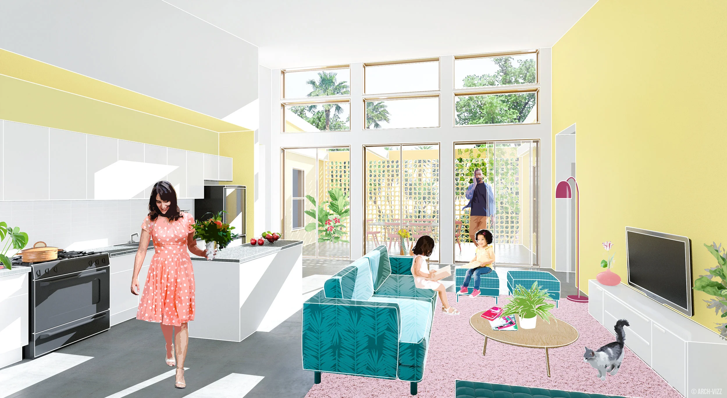
THE YELLOW HOUSE
INTERIOR VIEW RENDERING WORKFLOW III
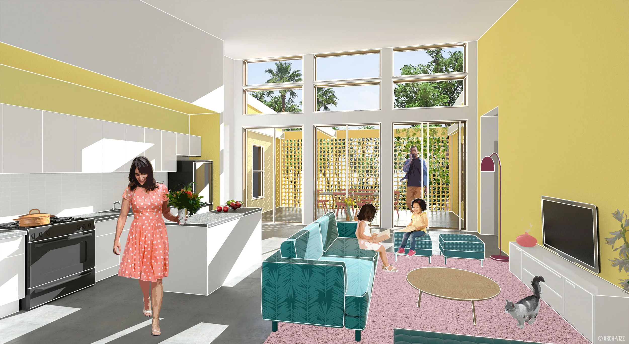
Sunny, Colorful, Full of life! This was the goal for this image - don't be afraid of mixing different colors and adding a lot of detail. When done right, this mix can give you beautiful results!
1 | BASE IMAGE
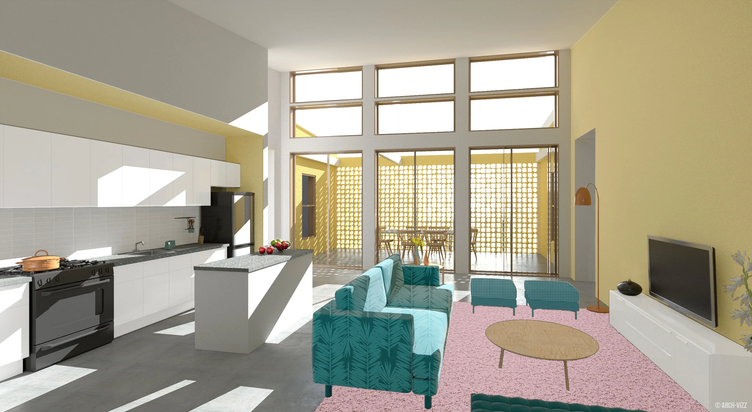
TIP: It isextremely important to get the scale of your objects right. This is a very small space so a bigger couch, for example, would've deceived the overall size of this room. For the base image I kept it very simple, with just some 3D furniture, basic textures and a direct sunlight with nice, soft lighting coming into the space. All other details were added in Photoshop.
2 | Rhino Export
RGB Rendering
Material ID
Render ID
Shadows
3 | PHOTOSHOP LAYERS
A | Lighting
Sometimes brighting up the image requires more than just using the adjustment layers in Photoshop.
In this case, the table in the foreground being lighter, as well as the wall above the kitchen, balances the image's overall contrast.
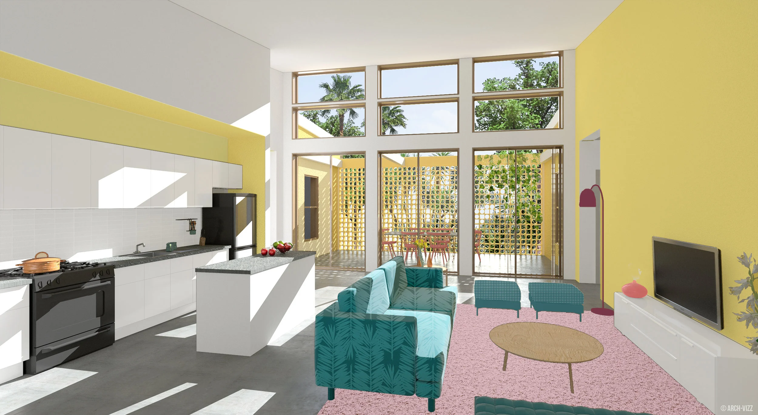
B | TEXTURE
If you spend enough time getting the textures right in Rhino, you can skip this step.
Changing the textures in Photoshop adds a collage look to the image if that's what you're going for. Otherwise, using the correct Rhino textures will do!
C | LANDSCAPE
Always remember to pay attention to your foreground, midground and background. Adding the right amount of landscape to the background, gives more depth to this space.
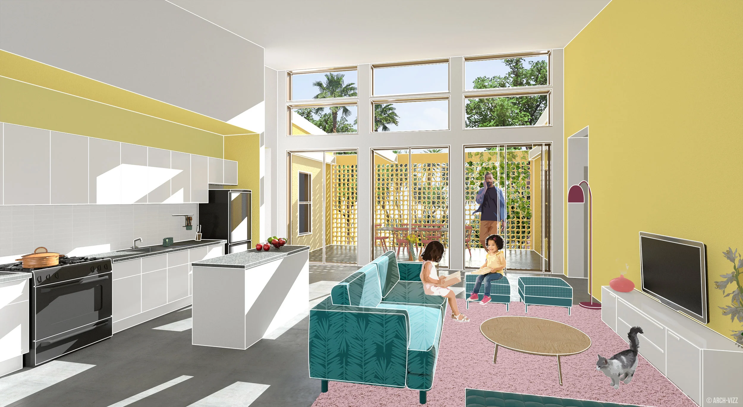
E | OUTLINE
Adding an outline to the most important objects, will not only highlight some Architectural features, but will also give a less realistic feel to the image.
The lines were drawn in illustrator and imported to Photoshop as a vector file.
D | ENTOURAGE
It's a full house! Adding entourage is the perfect opportunity to emphasize some of the colors, as well as the overall scale of this room.
Pay attention to some of the colors. For example, you can find tones of pink on the vase to the right, the girl's shoes, the carpert, the exterior chairs and the women's dress. This helps your eye to keep moving around the image.
Do the same with all colors and values.
F | Interior details
It's okay to add more details but make sure all the elements you add are at the right scale and helping the overall color composition.
G | FINAL ADJUSTMENTS
Lighting, color, contrast, levels... and voilà!
When using Rhino. focus on getting the right scale and a good lighting. Everything else can be fixed using Photoshop!
Any questions or suggestions? Leave a comment!
Renderings and Tutorial by Stefani Fachini


