MARISSA GUDIEL
PINKISM
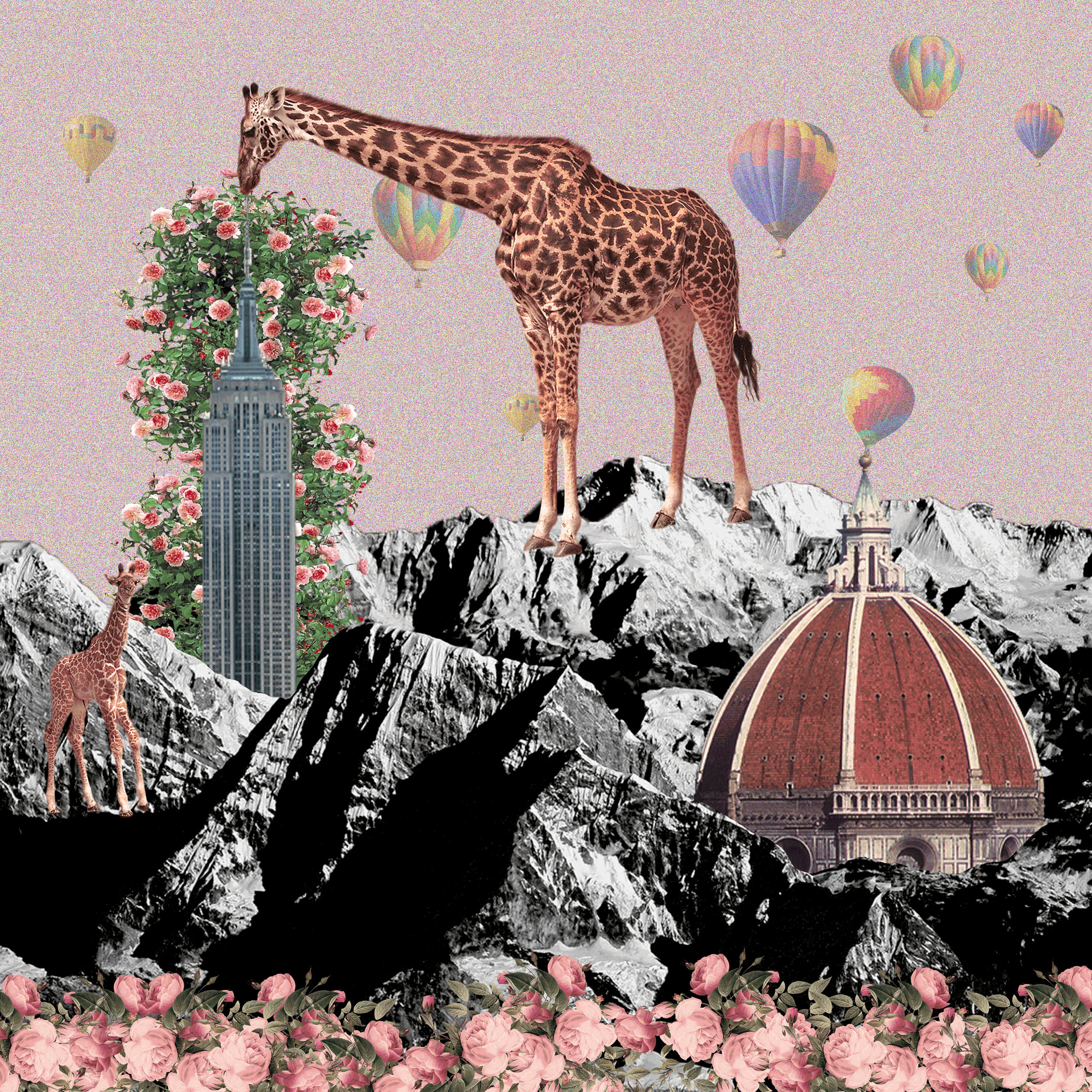
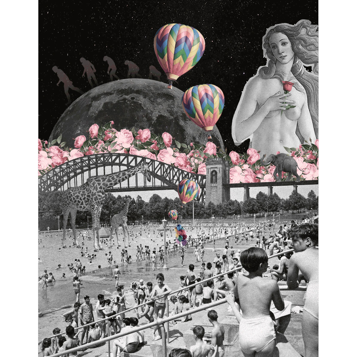
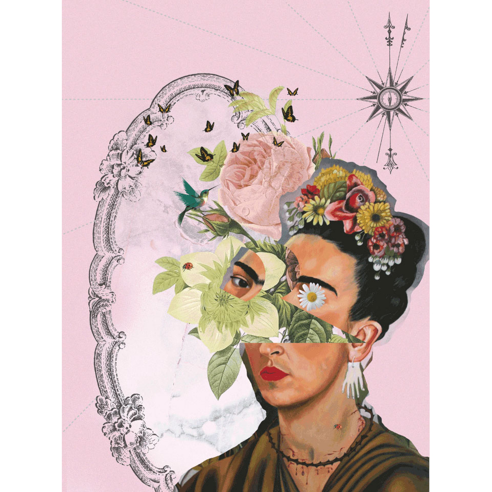
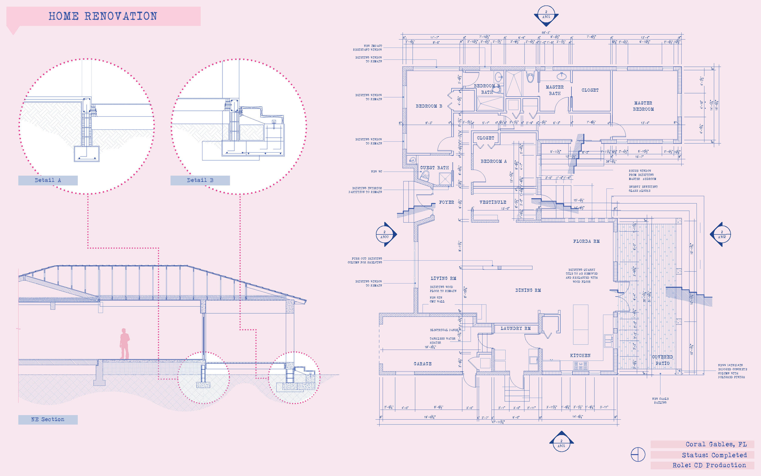
Marissa Gudiel is an Architectural Designer with an excellent eye for imagery. Her architectural drawings and collage work are very creative, very expressive and, of course, very pink!
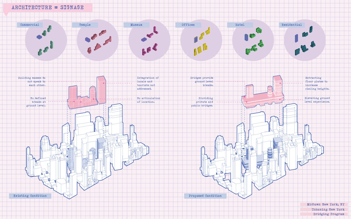
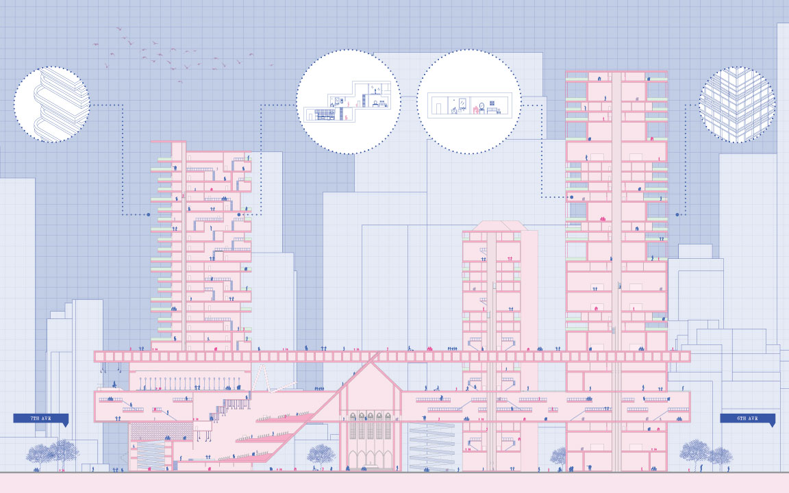
The color pink is iconic in her work and can be seen used in different ways throughout her images. In the pursuit of expressing her ideas to the world, Marissa isn’t afraid of mixing different techniques and using her own style.
For this interview, Marissa will be sharing a few of her architectural projects and digital collages.
About: In a few words, describe yourself and your work.
I am a recent Architecture graduate interested in understanding how human beings function and how design can influence our daily experience.
My work dives into understanding our mind while also conveying positive energies. I am a strong adherent to architecture being art and the one form of art that cannot be avoided. This is due to our lives revolving around being in a place that was designed for us. It is thus, our responsibility as designers to make an art that everyone can both understand and enjoy.
Can you tell us about your thesis project?
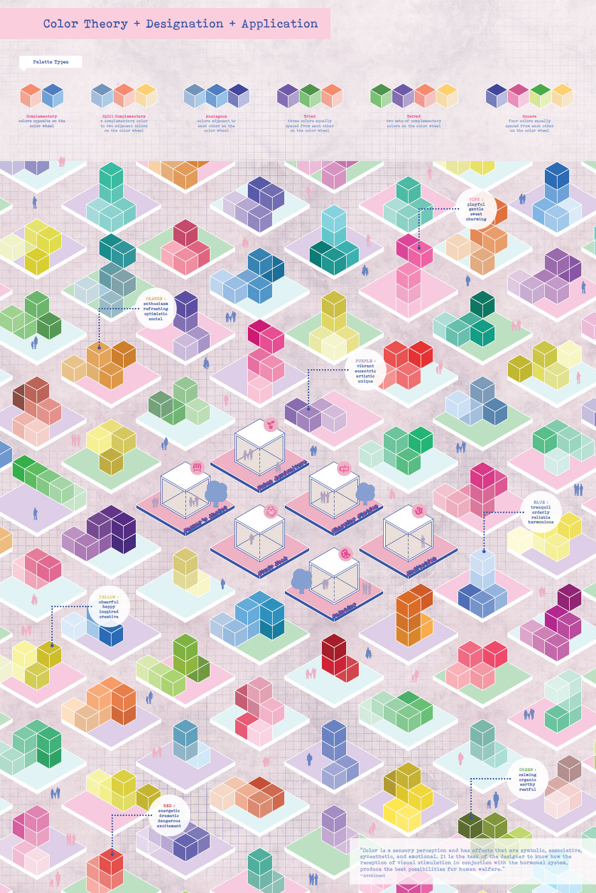
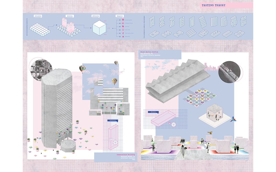
I investigated the potential of color in its ability to preserve brutalism, an architectural style that is not appreciated by the public because it is either considered to be “ugly” or “boring”. These are buildings that came about after the Great Depression and represent a culture of determined to move forward and staying hopeful. This is a concept that is not understood outside of the design world which is why I proposed the use of color to create a connection with individuals, as color ignites both memory and emotion.
My hope is that we will acknowledge color and its psychological impact in its vital role in architecture. As of now, color is the last brush stroke to projects when it should be an integral element to any project.
“My hope is that we will acknowledge color and its psychological impact in its vital role in architecture.”
What lead you to explore the project through this graphic style?
Not only was it a natural instinct but it was about being able to create a statement. I knew that my use of color would be impeccable in understanding the role of color.
What role does the color pink play in your drawings?
It really all resulted during my semester in Rome, back in 2016. My design professor at the time was not a fan of my palette and referred to it as “not being architecture”. It essentially became about either readjusting my graphic style to get a passing grade or believing in my work. I went for the latter, as I thought that if there was one person who did not see this hue as being apt for the design world then there had to be many more who thought the same. So, during this two year journey, I have been determined to being a contributor to the notion of making pink part of our design world.
For your final presentation, what is the relationship between physical models and final drawings?
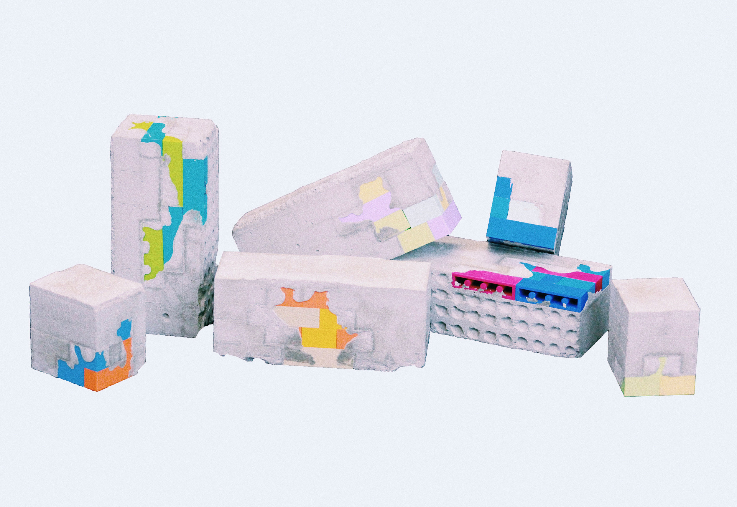
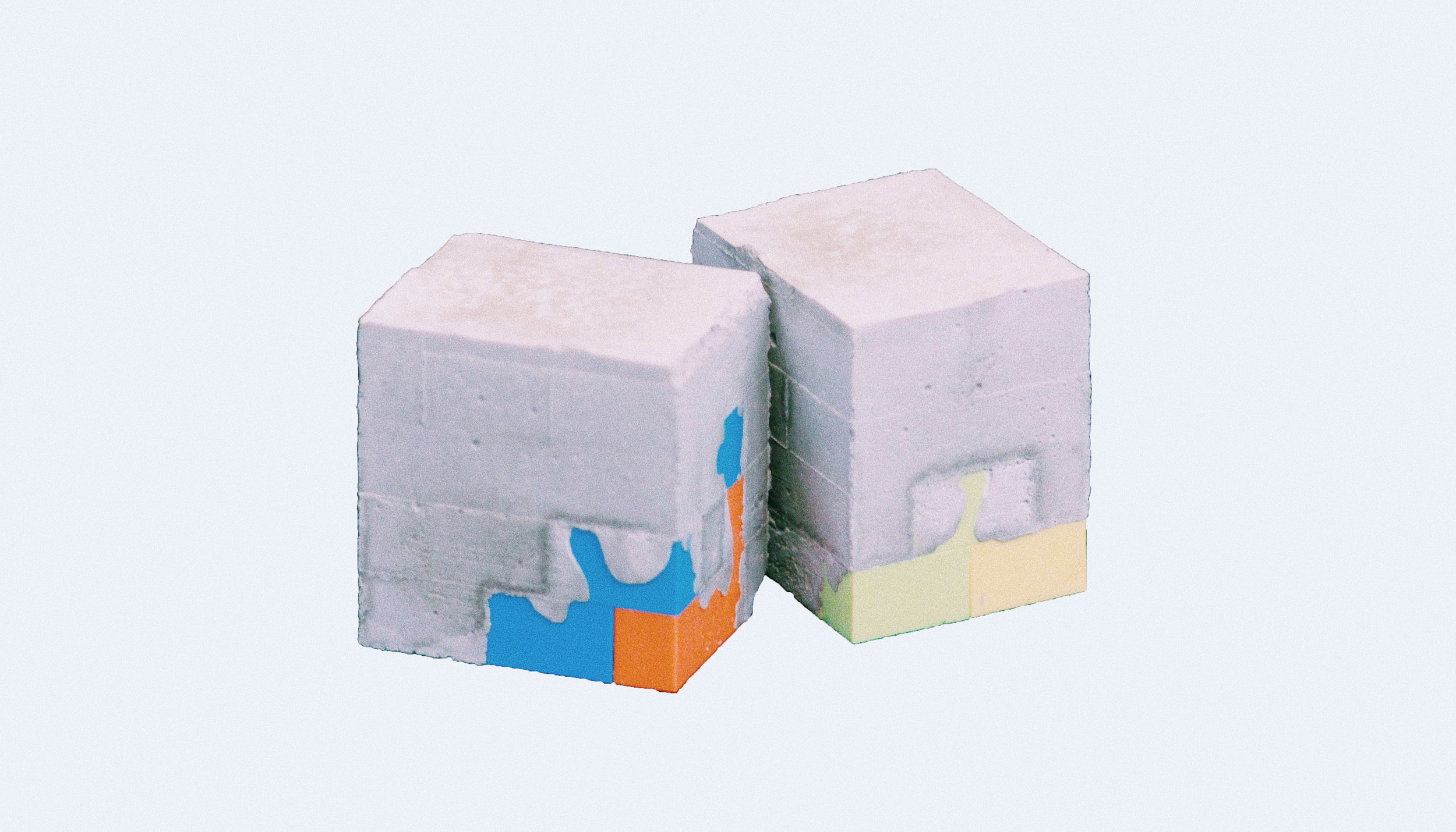
If I am to do a model, then it must be able to tell the viewer something that my drawings do not consolidate. It must be something that conveys a powerful thought. In my thesis, it was about demonstrating the harmony between color, in this case, Legos and concrete.
Which materials do you enjoy working with the most?
Concrete. The beauty of concrete is that the result is based on the formwork, meaning the mold that you create for it. This means that the extents of this material are endless. It forces your mind to think backwards because to understand the result you have to really get a sense of the process. Before realizing this, my concrete models were a back and forth between trials.
Are there a particular artists or designers that have influenced your work?
My work is a concoction of designer and the world. First, I fell in love with the extents of this world and the beauty of nature’s details to really understand both theory and design. Denisse Scott Brown has been a constant reference to the theory side of my projects. My design approach has resulted from an appreciation for the work of Louis Sullivan, Luis Barragan, Lina Bo Bardi, and Ricardo Legoretta. These are all individuals who have a sincere way of portraying detail and color.
Can you talk about your digital collage work?
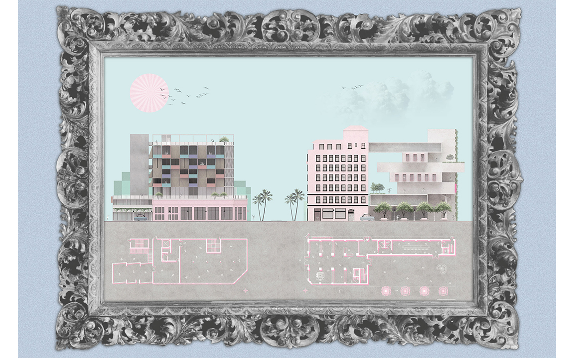
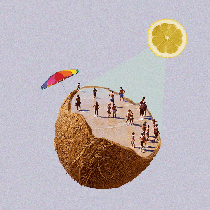
My digital collages are my leisure time and represent my thoughts. These are meant to stay true to anything that crosses my mind and transforming it into something that can be appreciated by the viewer. It is basically a decomposition of my mind. They are abstract and are meant to portray the freedom that comes with expression.
Could you show us / talk about the process of creating one of your images?
My images first start as an idea, an important point that I want to make. From there I sketch out a layout for that image, which is solely made up of words. Then it becomes about putting it on the screen. Before any final image gets my stamp of approval, I have tested that same idea in at least two separate ways. It becomes this thought of “it is missing something”. With that thought in mind, I keep adding to it and making sure that I do not take away from my point by making it confusing for the viewer. You have to keep in mind that what you see in your drawing is something that may not be interpreted by your viewers, after all that is art. But when you are attempting to make a point you have to be sure that your work can speak for itself.
What advice would you give to young designers?
There is no right or wrong answer nor is there anyone better than each other. To become great at what you do and have others enjoy your work, you have to first understand what your strengths and weaknesses are. The hardest part is taking that first step in becoming passionate about your work and showing it to the world. It becomes much easier when you believe in your work to the point of not being intimidated by how others may feel about it. It also helps to realize that you are not meant to excel in every area within the design world and that we are all so different. That is what makes our world so extravagant and diverse. Most importantly, love your work but also love the work of others.
“The hardest part is taking that first step in becoming passionate about your work and showing it to the world. ”
Marissa, thank you for taking the time to interview with Arch-Vizz! Your work shows a level of passion that is truly inspiring.
You can find more about Marissa's work on her instagram page @gudiel.design
Interview & Images Courtesy: Marissa Gudiel
Interviewer: Stefani Fachini
