SEIJI ANDERSON
VISUAL STORYTELLING
Seiji Anderson is a visualization artist, based in Brooklyn NY. After studying Architecture, Seiji found his passion in bringing architecture to life through digital representation - but his work is much more than that. Through a series of renderings and animations, with an artistic touch, his work turns architecture into storytelling.
For this interview, Seiji will be talking about his work, inspirations and more.
Seiji, tell us a little bit about yourself and your work.
I’m a New York City based designer and 3D artist. I studied architecture at the University of Miami, which led to my current career in architectural visualization. I’m currently a senior member of the visualization team at Brooklyn Digital Foundry, where we create still and video content for a wide range of clients.
What stands out the most to me about your work is the attention to every detail. From the way the light hits every object, to the composition of the overall image. How did you learn to create your images and how does your background in Architecture influence your work as a visualization artist?
I think the simple answer is a combination of practice and holding yourself accountable for the work you create.
For me, I think there were a handful of key moments that have shaped my learning and practice. A great number of years in grade school were spent learning Adobe products after being introduced to them by a handful of art teachers, primarily in a commercial art and graphic design context. It was definitely a huge part of my foundation, and a leg up once I realized that I could use these tools in conjunction with 3D to finish images.
Besides the general rigor and depth that is required in learning architectural design, two other educational experiences come to mind. One was an undergraduate course in architectural photography with Steven Brooke, which helped me realize the close relationship between photography and CGI. The other was a professional mentorship with Ash Thorp, which above all helped in understanding how to break down complex problems into their simplest units. While each of these teachers were from very different disciplines, their dedication to the process and methodology of their crafts left a lasting impression.
With regards to architectural imagery I feel there are key ingredients to every shot: camera position / focal length, lighting, color, texture, staging. It’s my job as an artist to make intentional decisions about the combination of these ingredients to express an idea.
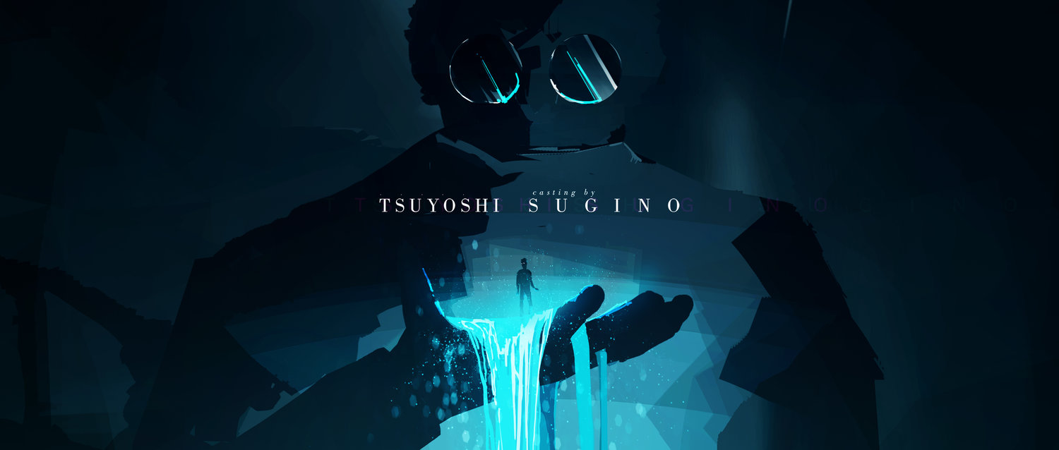
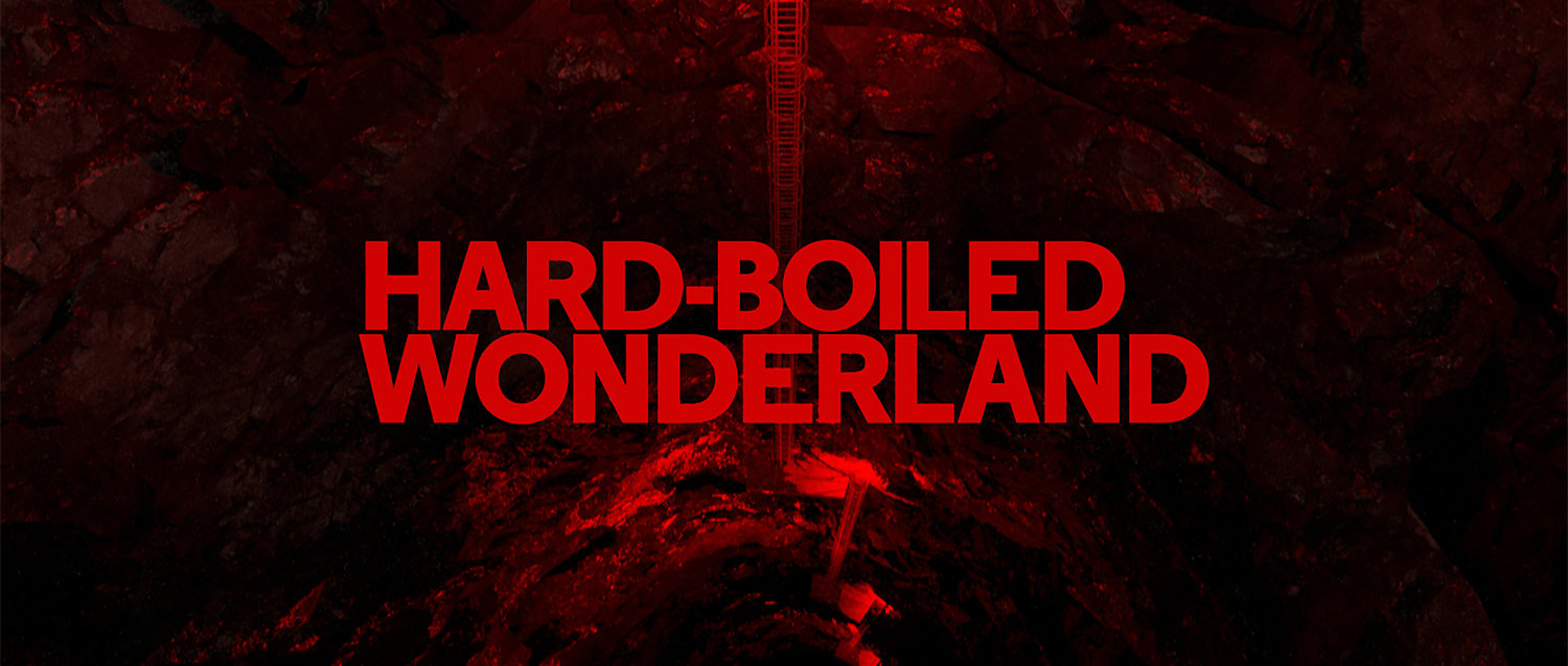
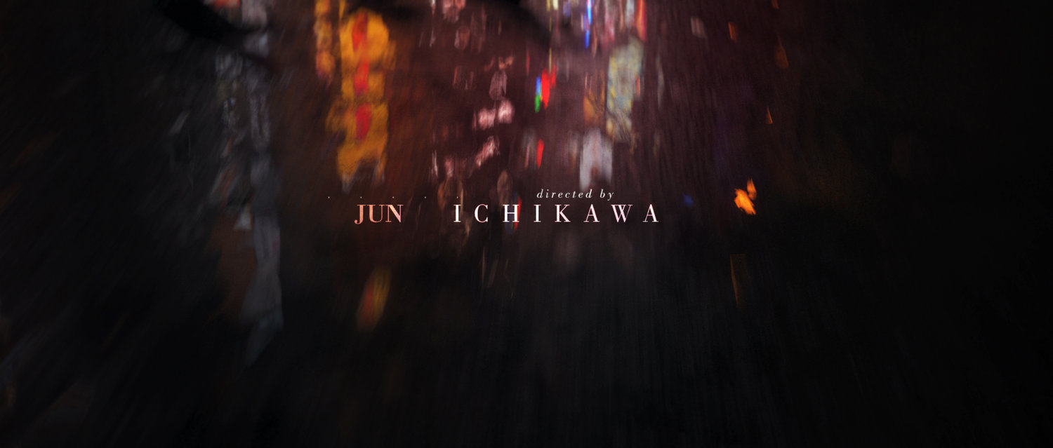
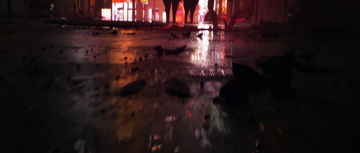
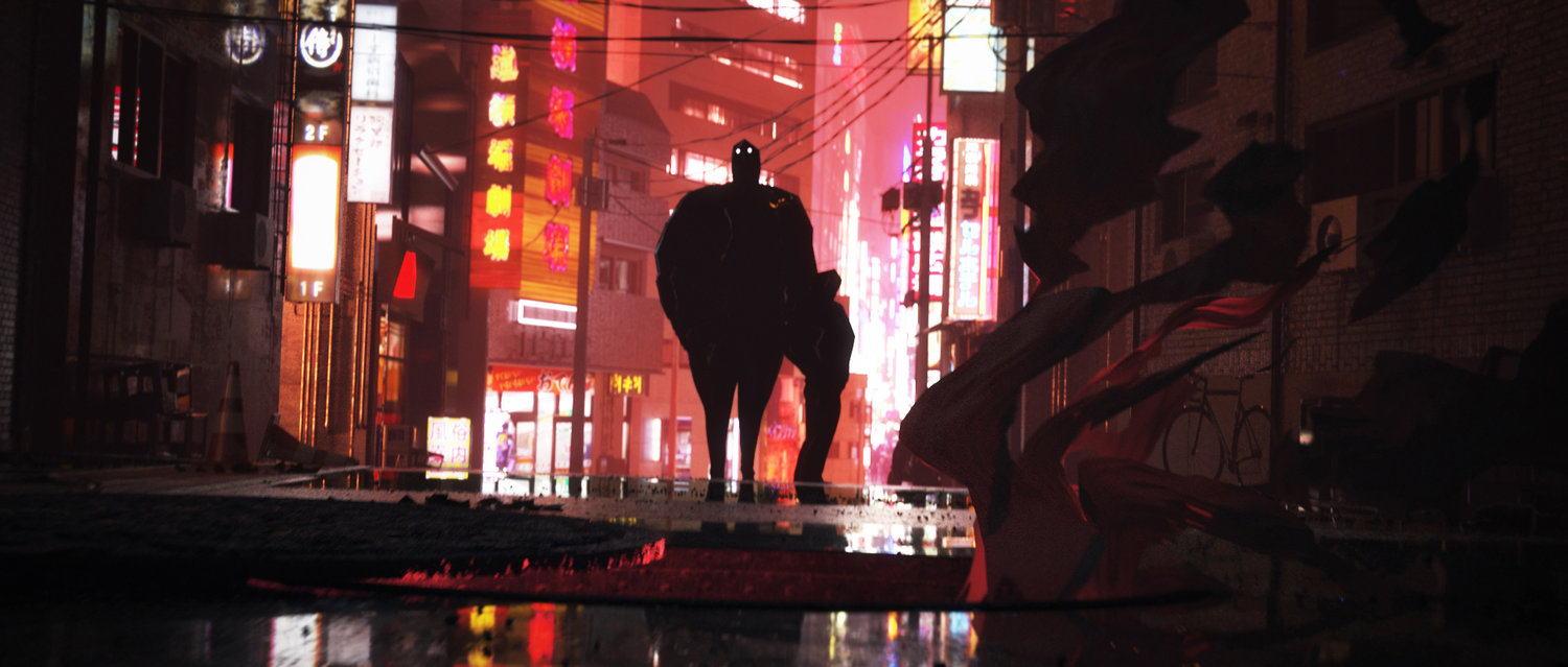
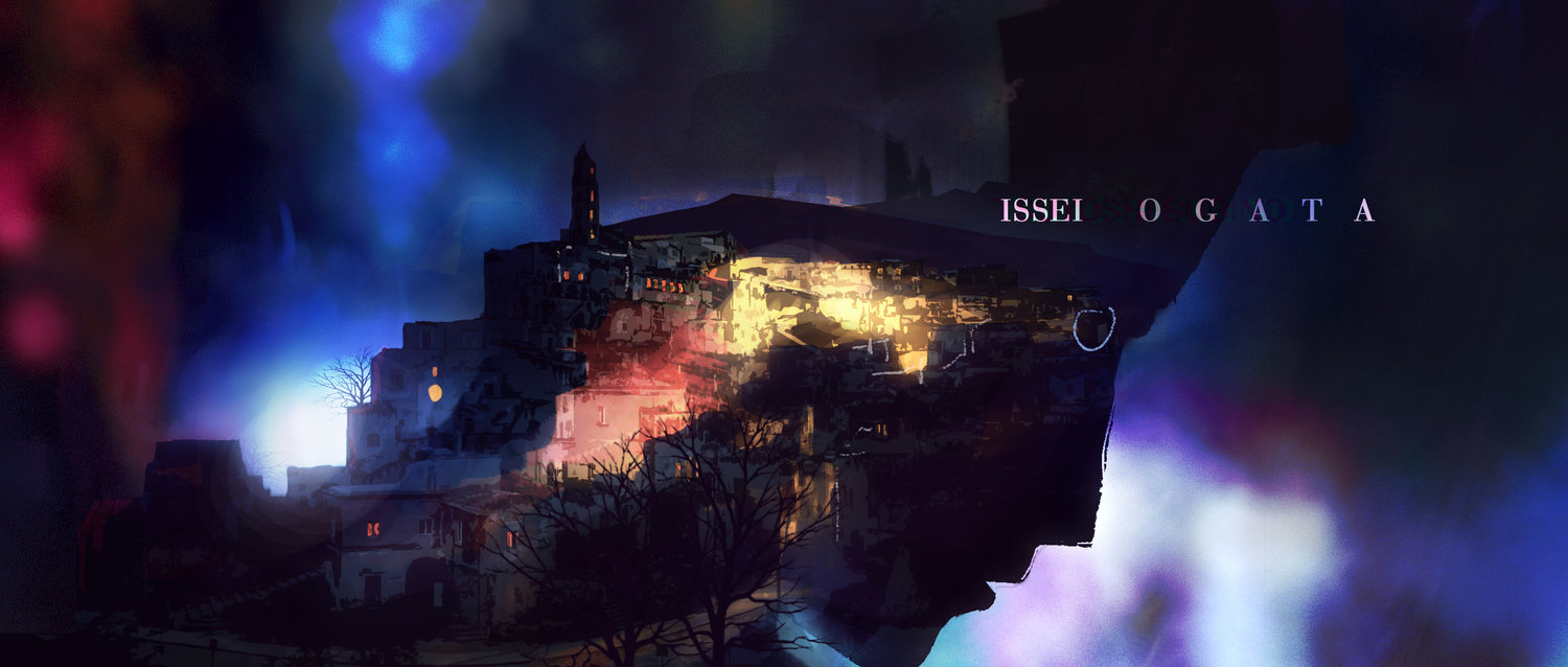
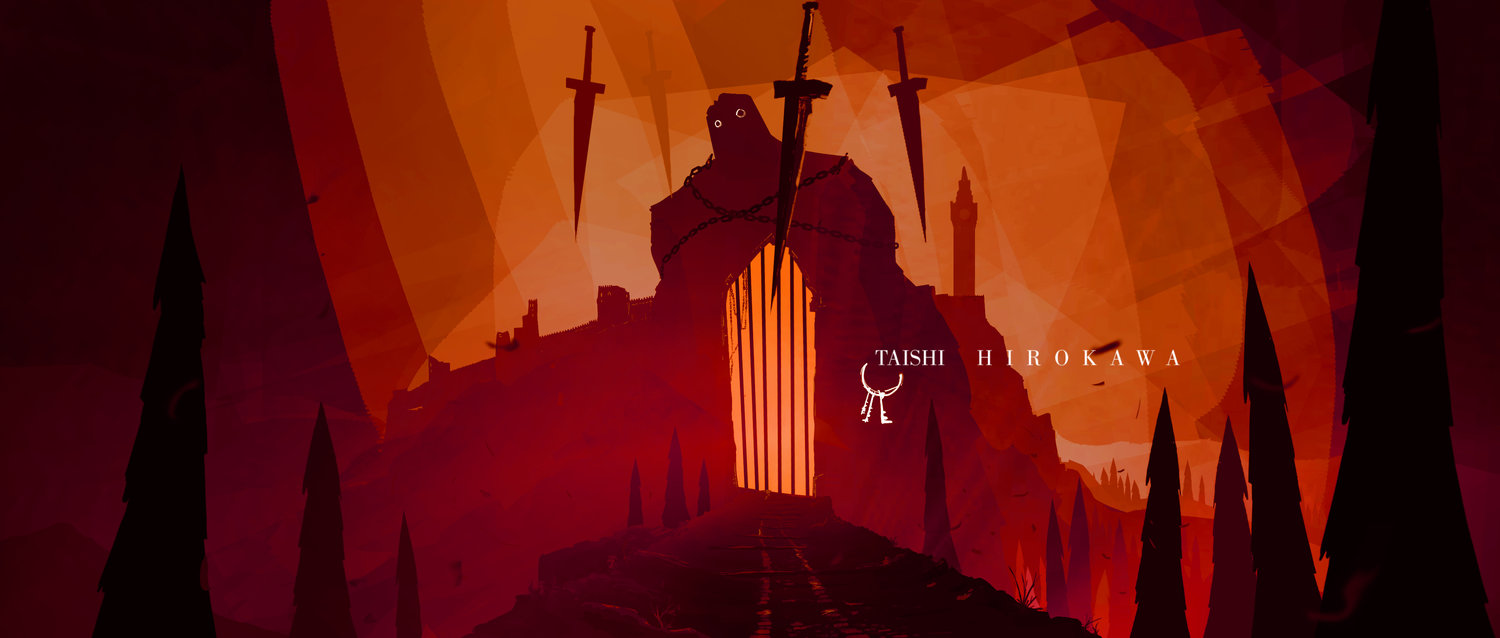
Speculative title design based on Haruki Murakami's Novel, Hard-boiled Wonderland and the End of the World.
Where do you look for inspiration? Do you have any artist or photographer that inspires you?
I feel that there are too many people to name, there truly are so many talented artists, designers and photographers out there. I like to follow the motion design and entertainment industry in particular, as I’ve found there are many lessons to be gathered when it comes to presenting ideas in short video format, which is a large part of the visualization work I do professionally. Some particularly inspirational artists for me include: Ash Thorp, Ben Hibon, Danny Yount, Simon Holmedal, Toros Kose.
While following visually based work fuels many ideas behind technique, I’ve found that my other main source of inspiration is literature. Books tend to be a huge driver for ideas and projects that I pursue in my personal time. I’ve been particularly inspired by Haruki Murakami during the past couple of years.
When working on an image, how does your personal work differ from your professional work?
The major difference is in subject matter. I rarely create personal work that is strictly an arch-viz project. When I do, they are primarily done in an effort to push my technical skills in image-making. As mentioned, a lot of my personal work of late has focused on trying to build narrative and a little story, inspired mostly from existing literature. I’ve yet to genuinely build my own stories from the ground up, but I think that is part of the longer-term goal.
Professional work on the other hand introduces the balancing act of finding where your own artistic sensibilities can ultimately bring value to your client. It’s definitely a different dynamic, but overall I find the personal work to be much more difficult to execute. Probably because projects are tied to much more concrete deadlines.
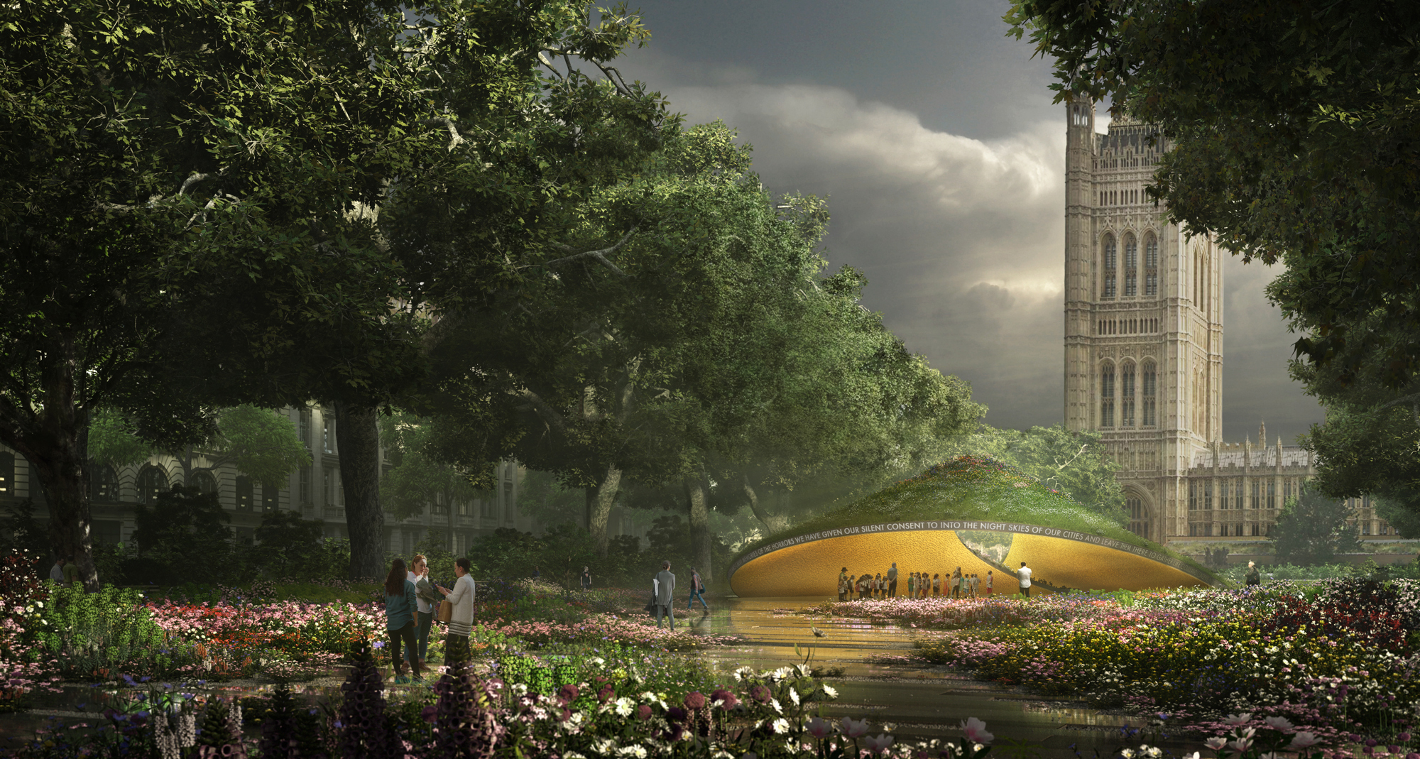
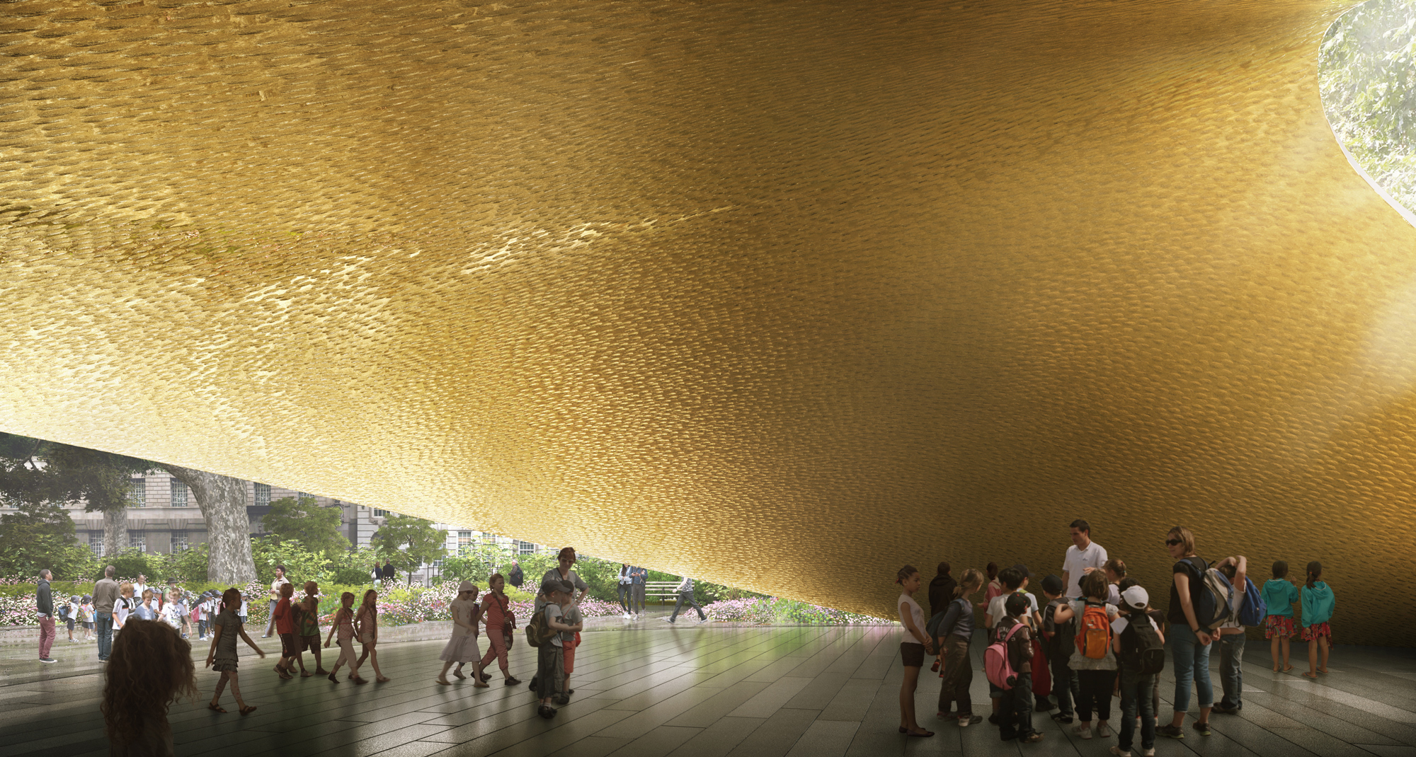
Competition Renderings for Allied Works Architecture's bid for the UK Holocaust Memorial. Created at Brooklyn Digital Foundry.
Can you talk about your 60 day challenge of creating one image a day? What did you learn the most during this process? What kept you inspired? What was your favorite image and why?
As I’m sure many would infer, this endeavor was inspired by Beeple, one today’s legendary designers. It was also one of my first forays into doing personal work that was not primarily based on arch viz, and was a fairly open sandbox in which I would mostly explore non-photorealistic 3d. The one loose goal was to create a bit of animated content each day.
It was definitely a tough project, I think the main source of inspiration during the process was being able to try my hand at a pretty wide range of ideas and techniques that you come across but never really had an excuse or reason to use in a professional setting.
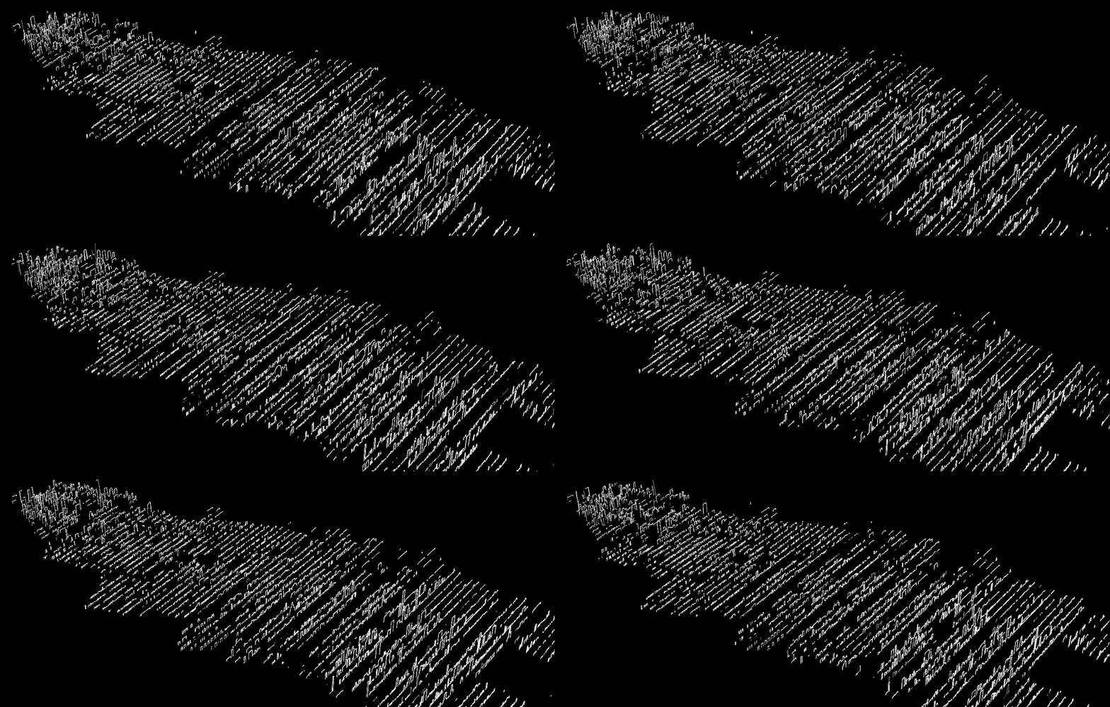
Probably my favorite image was this, which call ‘Cross-sections of a City’:
Could you show us or talk about the process of creating one of your images? Do you experiment with different rendering tools or do you follow a similar process for all your images? Which software do you use?
My primary tools include: 3d Studio Max, VRay, Forest Pack, Photoshop, After Effects, and Premiere. While I do explore other tools fairly regularly, these have been solid and reliable, especially for delivering animated content. Since professional work typically has a tight turnaround time, experimentation of new software largely happens in my personal work. It’s important to me to have a low-risk environment to try out new software before relying on it in a full-blown production scenario.
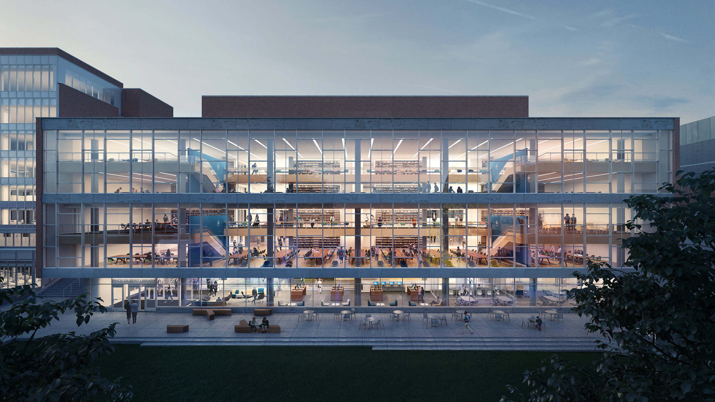
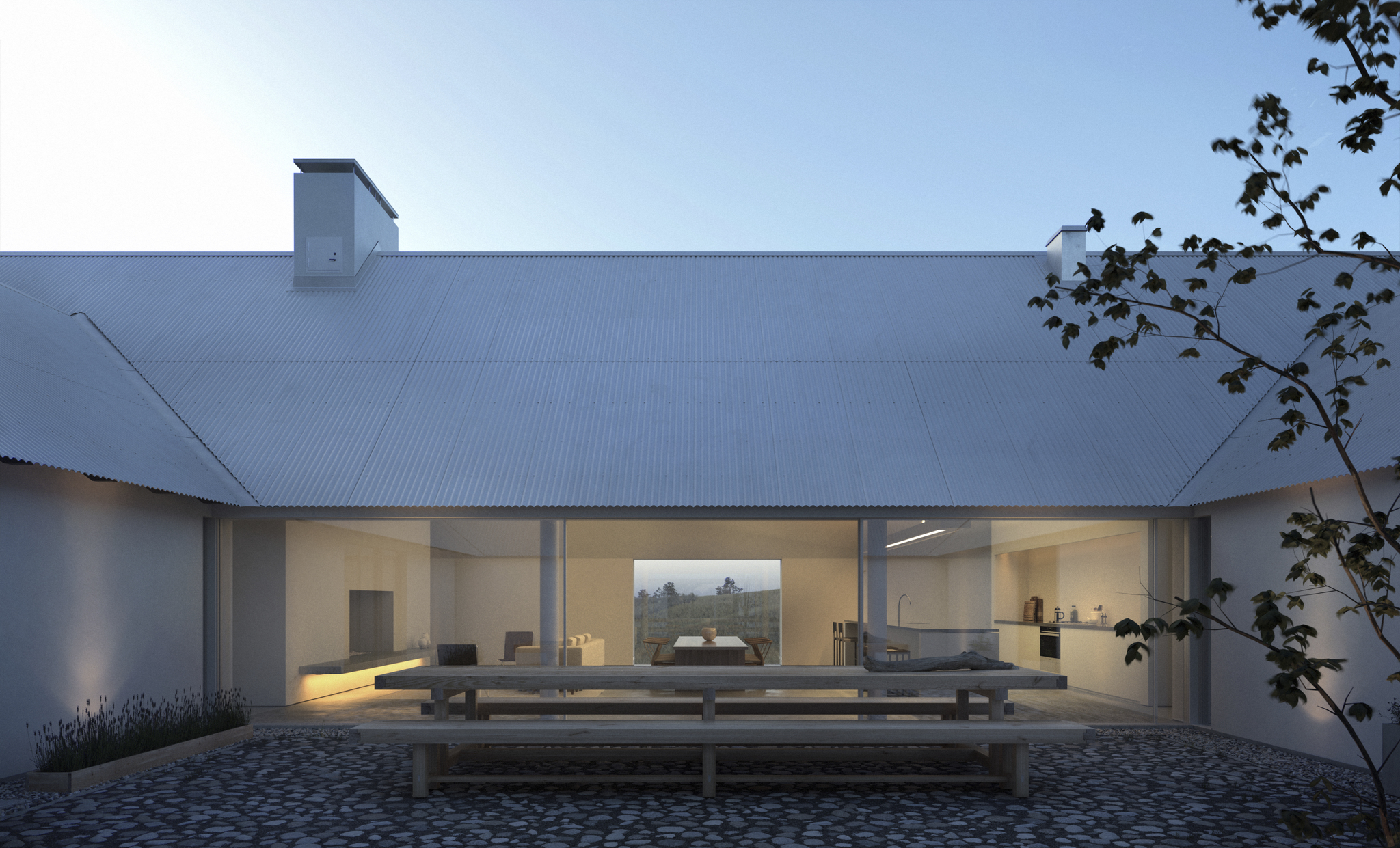
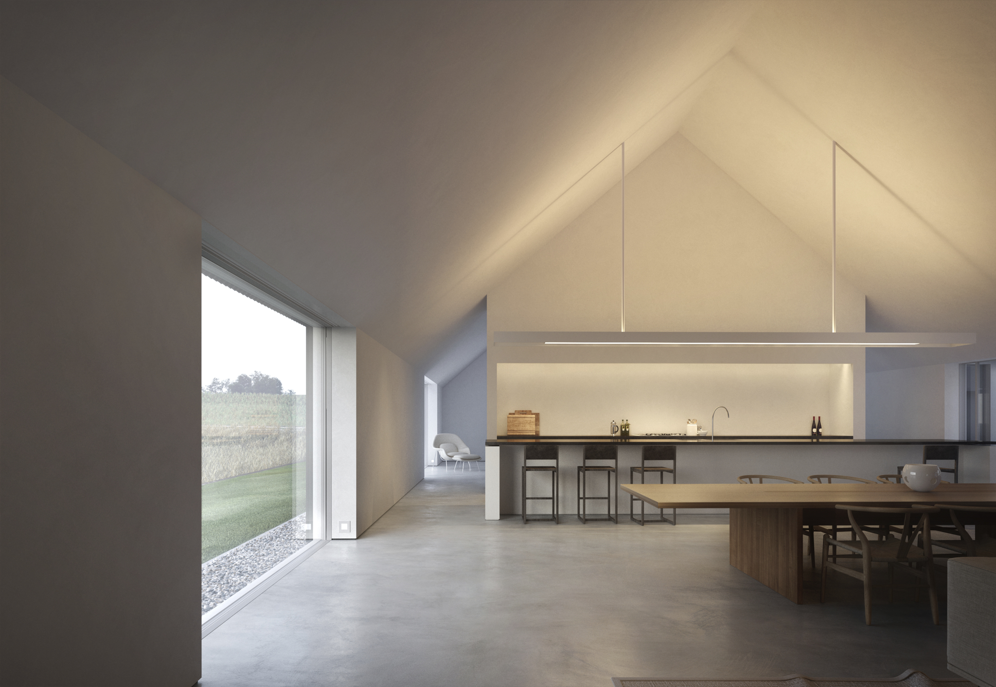
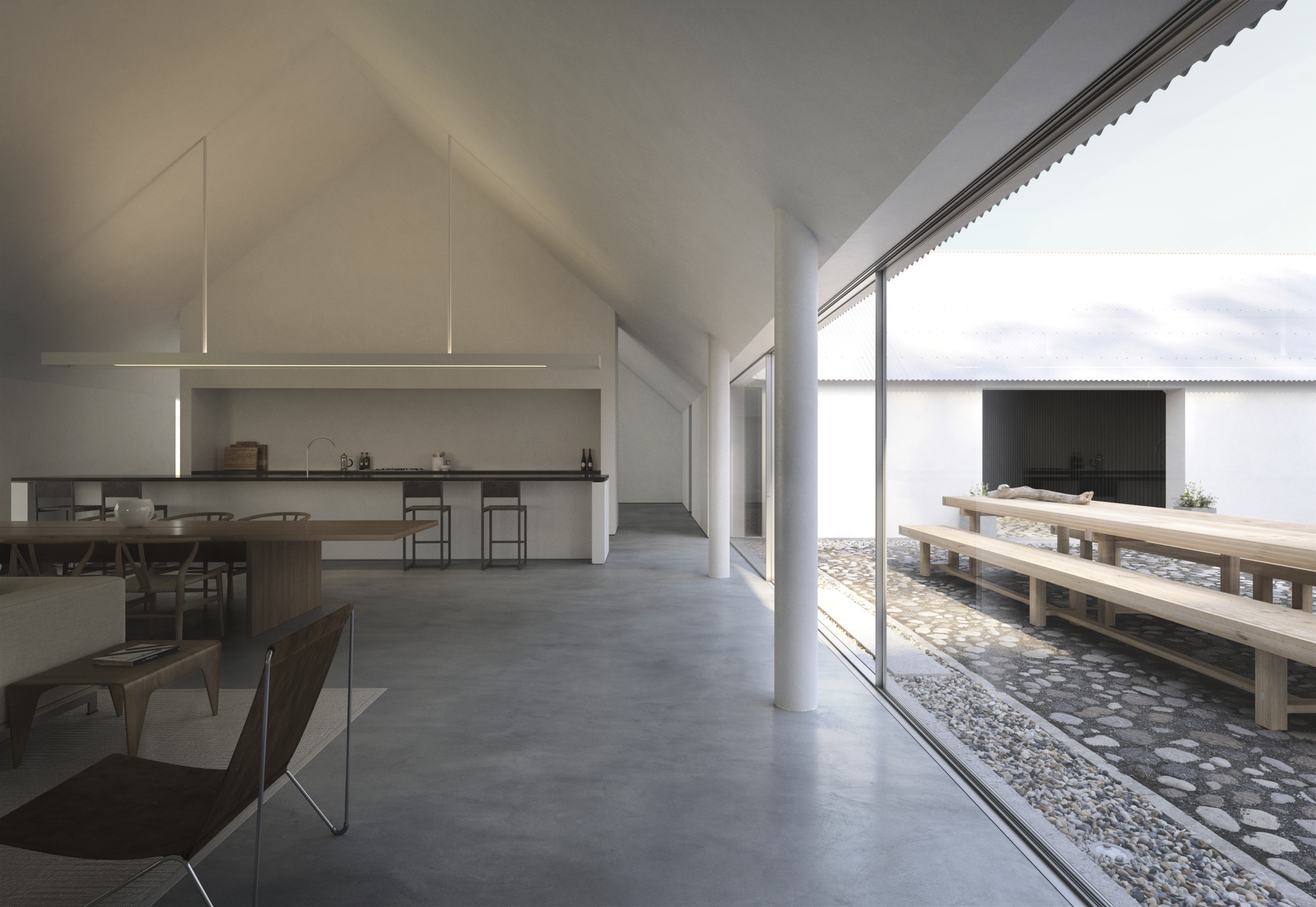
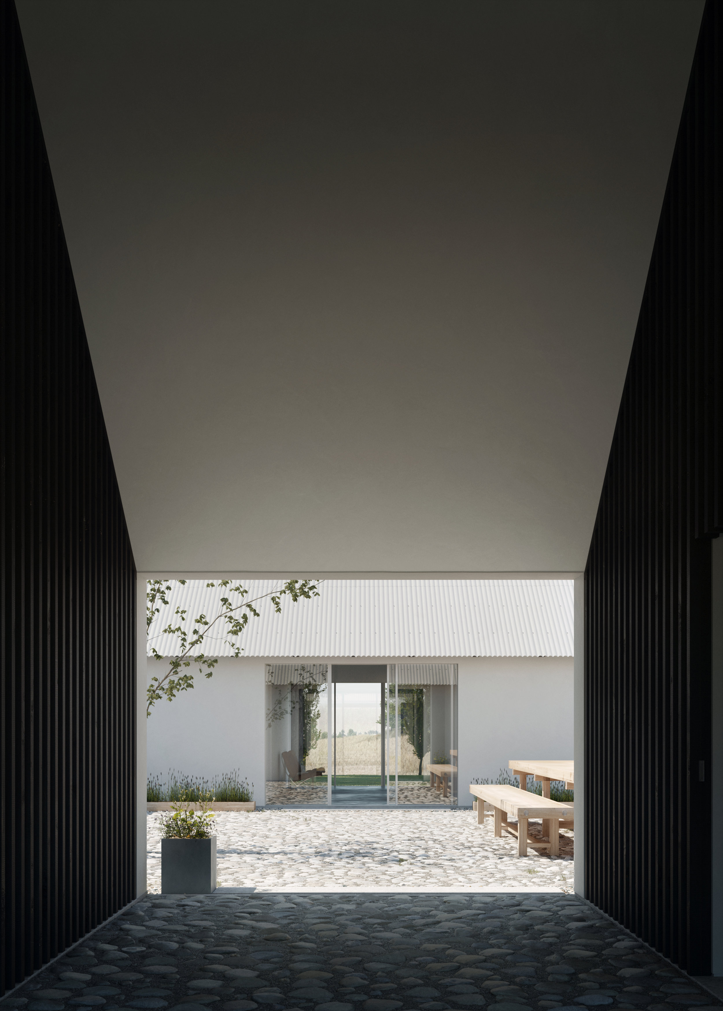
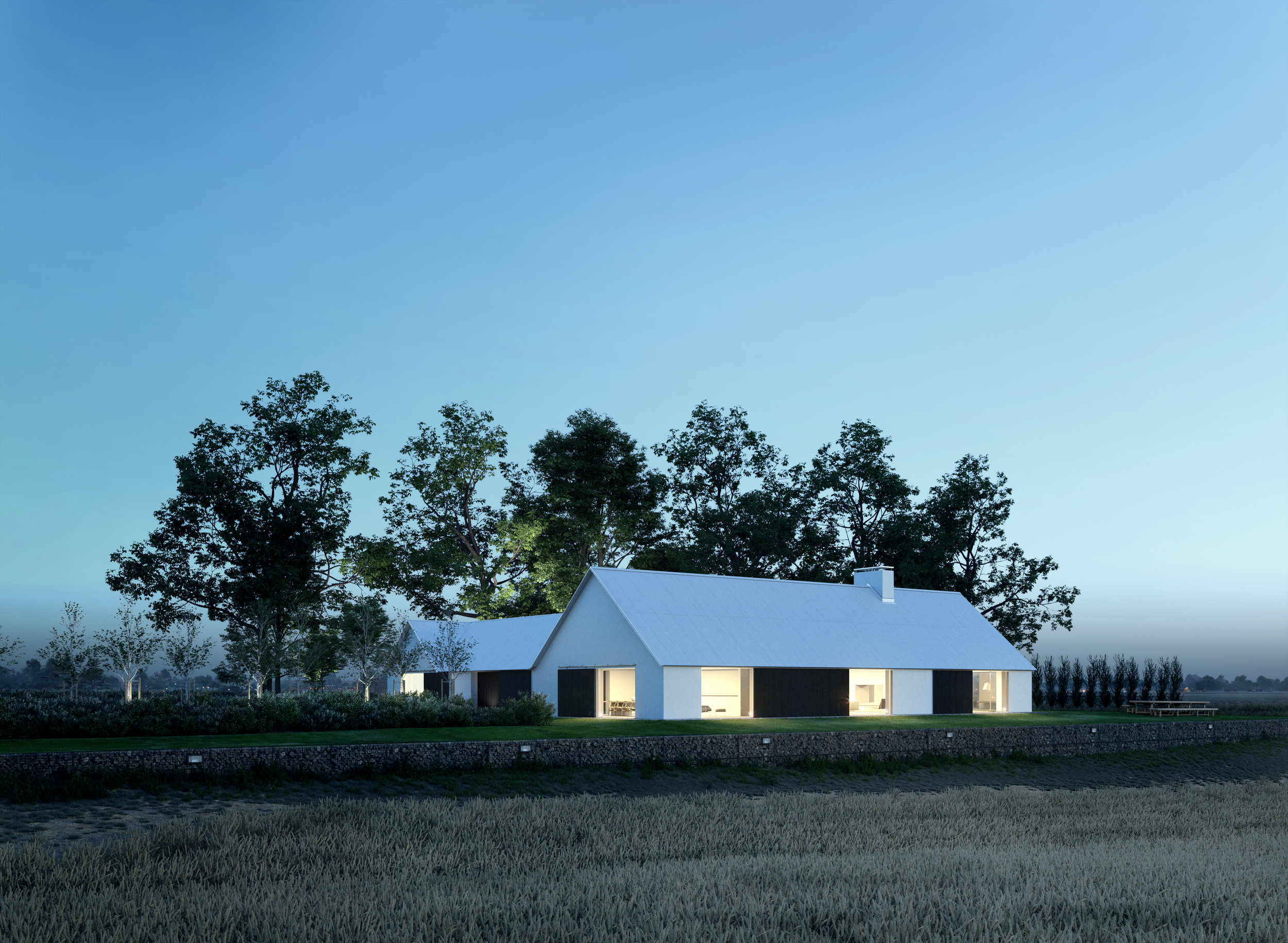
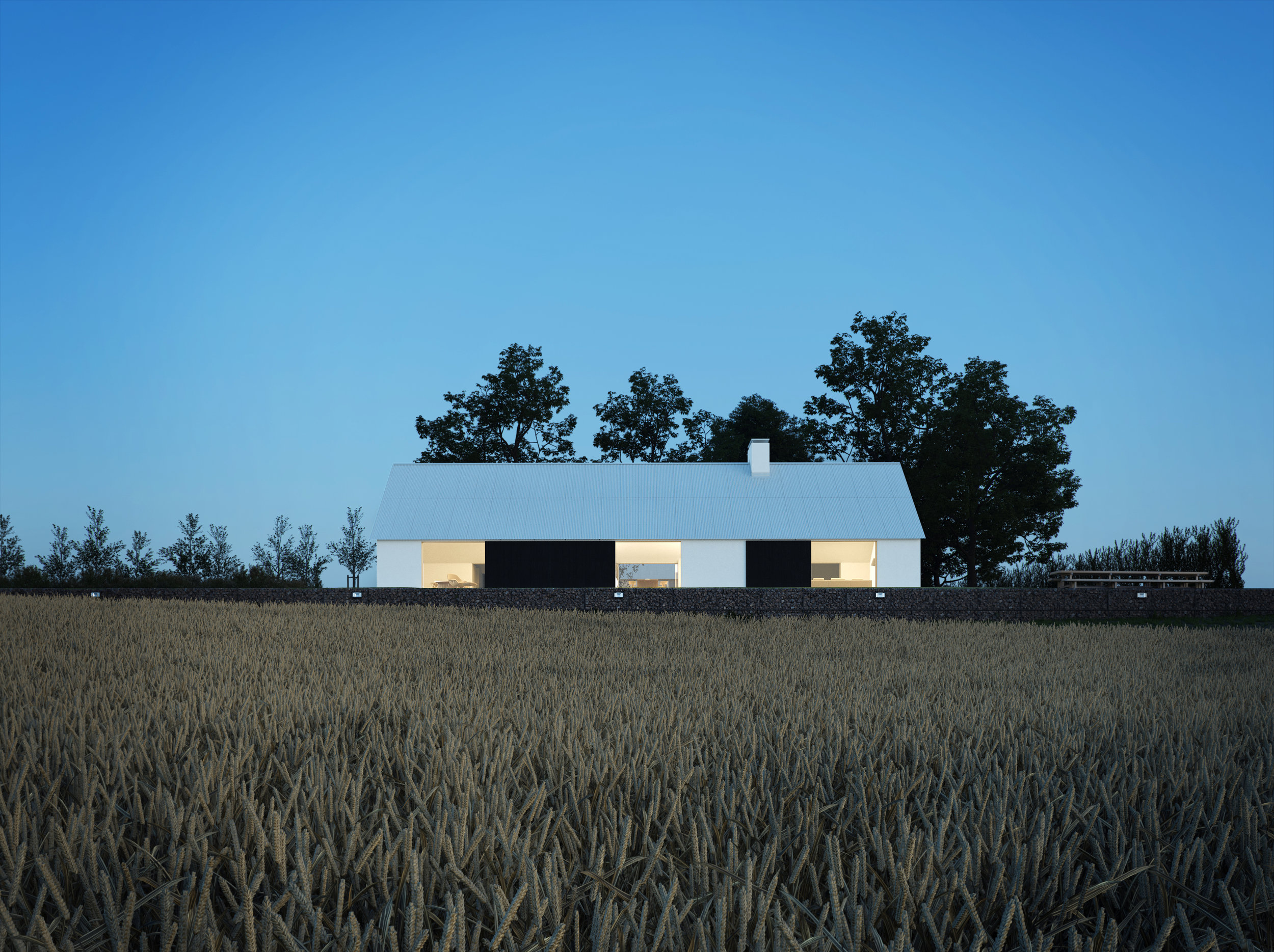
In terms of the image-making process, a typical client project gets divided up into a number of drafts, which incrementally nails down key parts of the image. Ideally the process starts with a white-plaster rendering to explore composition and lighting. From there it’s simply continual rounds of refinement on the lighting, materiality and entourage in the image. Here are some raw drafts of the process so you get an idea of the progression, in terms of image development and rough vs final quality rendering.
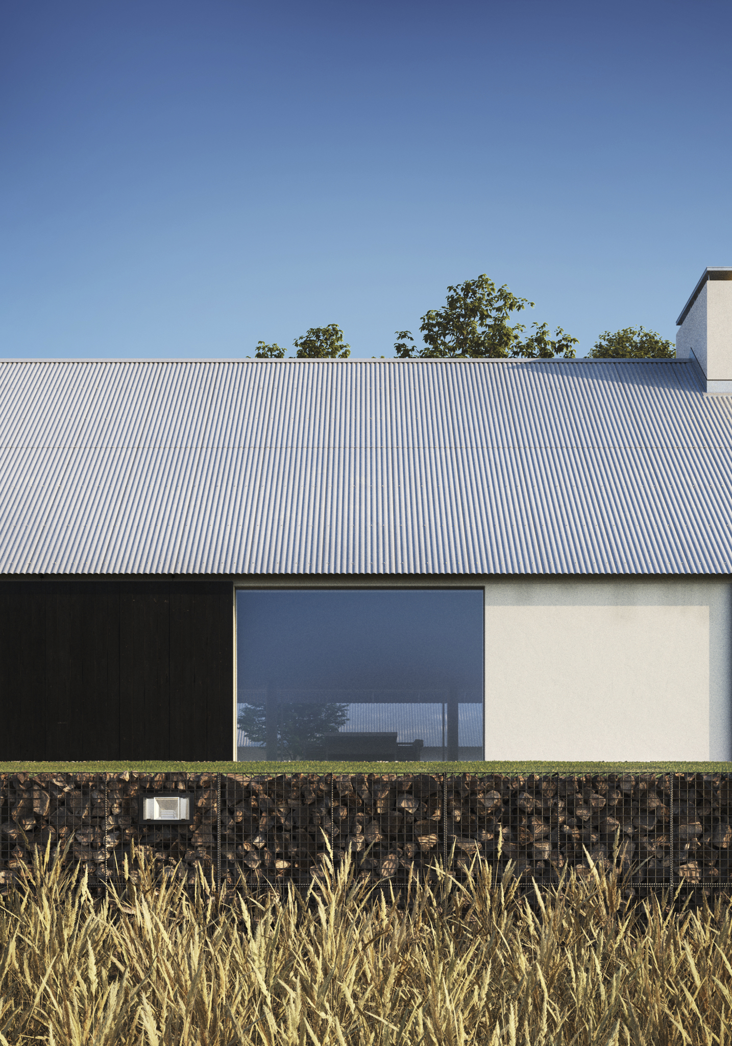
Full CGI images of John Pawson's Baron House. Created at Brooklyn Digital Foundry, based on reference photography by Lindman Photography.
What are the biggest challenges working with an interior vs an exterior rendering? Does your work flow vary between these two or are they similar? How so?
I tend to find them fairly similar. The primary challenge to me on an interior shot is balancing the lighting as it requires a bit more patience to get right. My image production workflow is the same. It’s still very much about mixing those basic ingredients of composition, lighting, staging etc. In this case the staging becomes a more interior design type problem, but ultimately even those interior design decisions are informed by those basic components of the image.
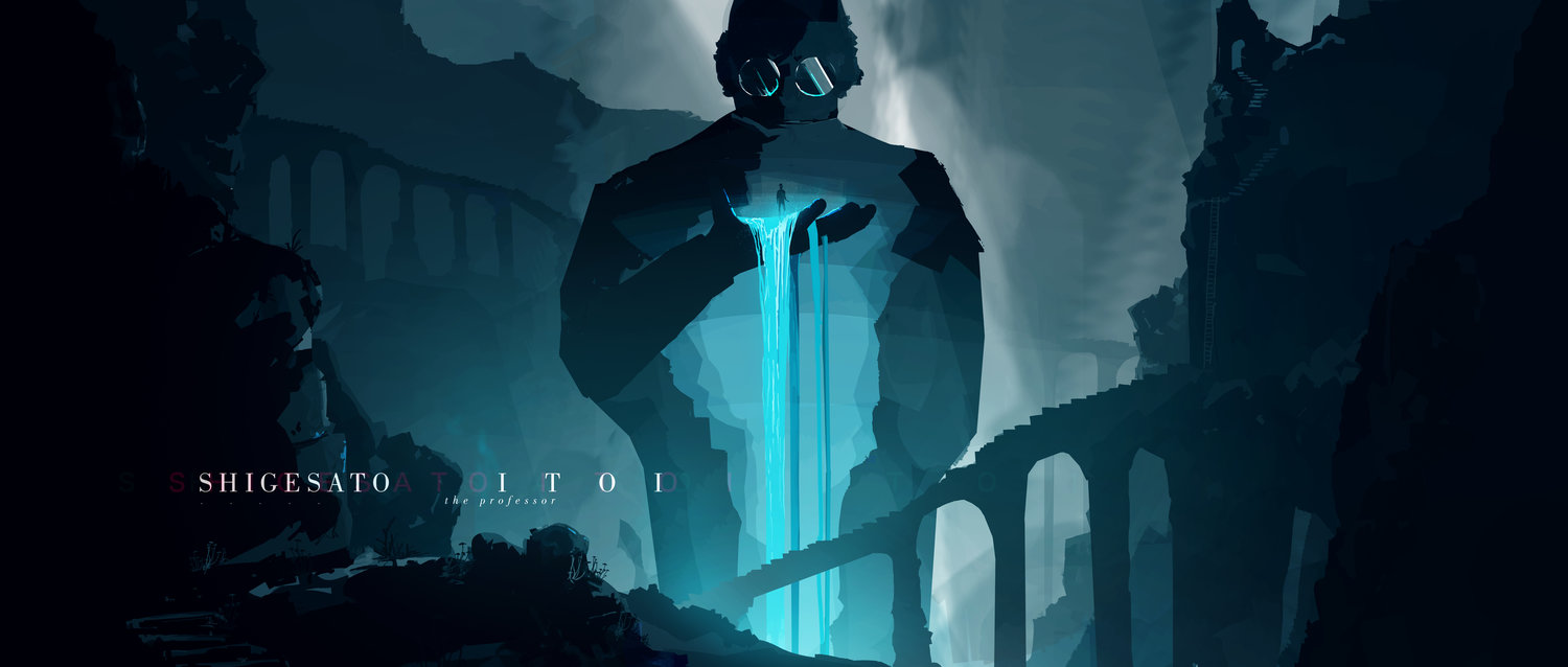
Speculative title design based on Haruki Murakami's Novel, Hard-boiled Wonderland and the End of the World.
When expressing an architectural idea, do you find renderings or videos to be the most effective? Why?
Personally I think that video inherently has more potential to deliver a complex message with regards to architectural concepts. Just the simple fact of being able to show a multiplicity of shots to help clarify a viewer’s understanding of a project makes the medium quite powerful. However, it’s really a matter of selecting the proper tool to convey the proper idea. There’s still something undeniably powerful about a single image hitting on all cylinders that gets to the core of an architectural concept.
Hard-Boiled Wonderland: https://vimeo.com/328336952
Maybe it has to do with my architectural background, but I really liked how Manhattan got broken down into a playful and graphic style through this rendering technique.
What advice has influenced you the most?
“You will probably never be 100% happy with the things that you make, but you must continue in search for that.”
It’s something I’ve been told several different ways. Pursuing creative work has always been challenging and I’ve found myself feeling lost and unconfident more times than I would care to admit. I find it an important reminder that it’s natural to feel that way towards the work I create; in a way it just means I care.
What advice would you give to young designers?
I think this is advice that I still give myself: get your mileage in early, be patient, be diligent and practice. Find joy in the creation process, because that is in your control.
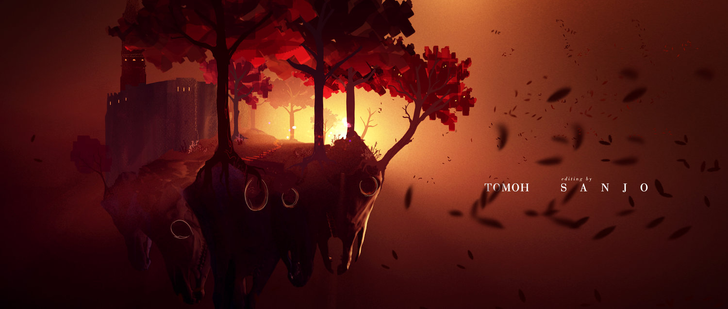
Speculative title design based on Haruki Murakami's Novel, Hard-boiled Wonderland and the End of the World.
“Find joy in the creation process”
Seiji, thank you for taking the time to interview with Arch-Vizz and talk about your amazing work.
You can find more about Seiji's work on his website seiji.nyc and his instagram @seijigram.
Interview & Images Courtesy: Seiji Anderson
Interviewer: Stefani Fachini
