ANNAMARIA GIUGLIANO
CREATING A VISUAL EXPERIENCE
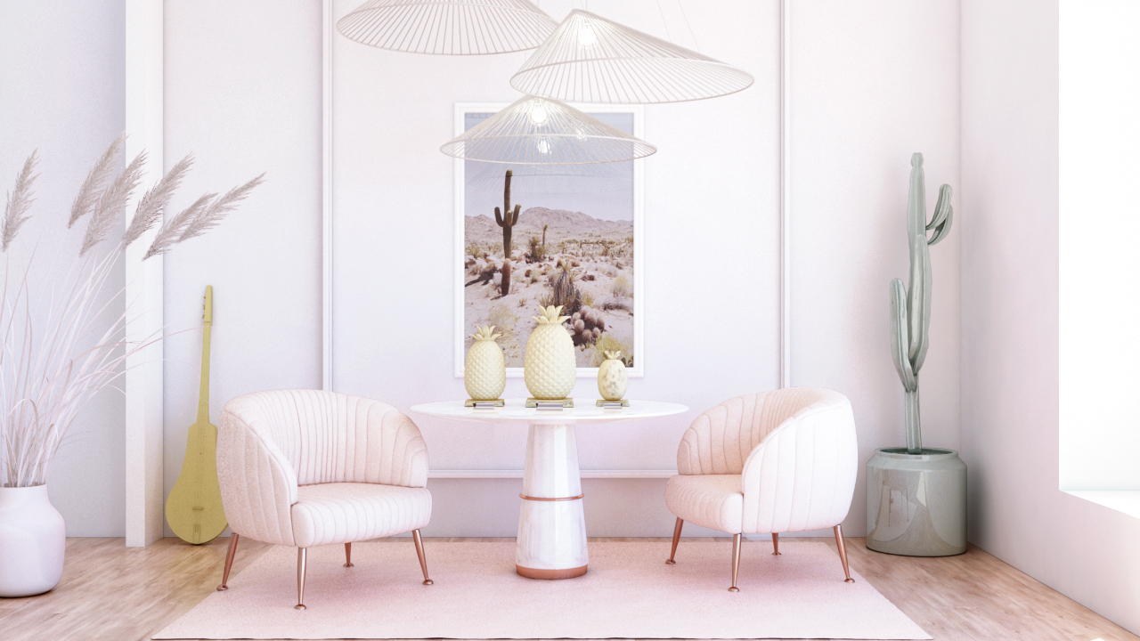
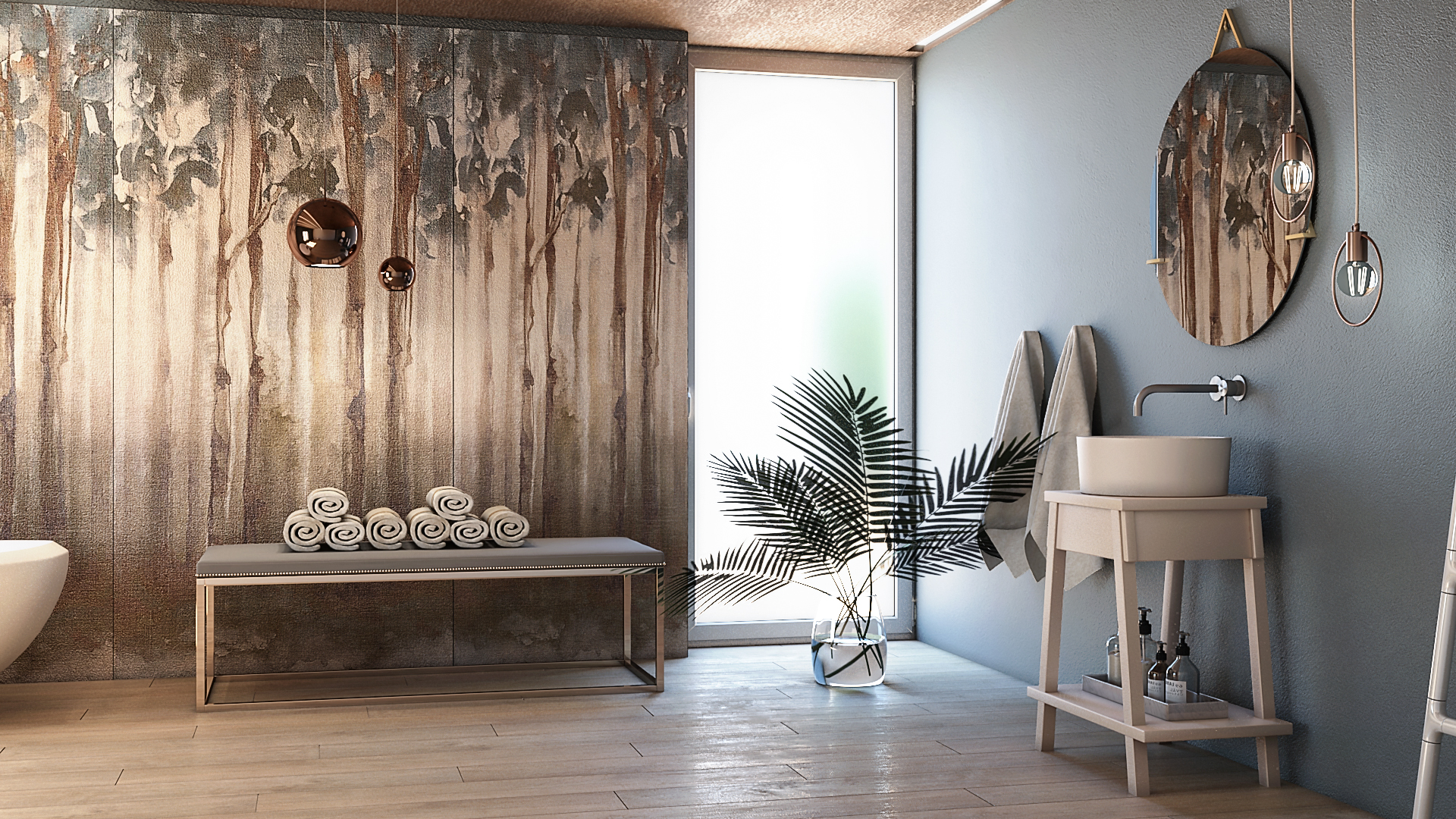
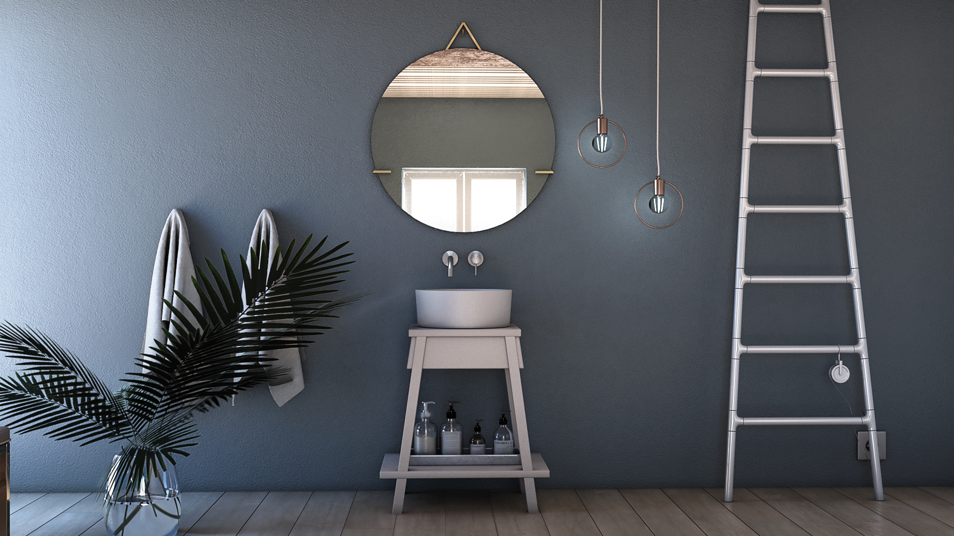
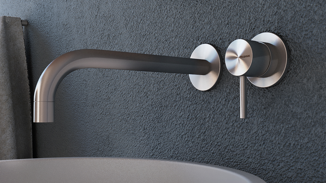
Annamaria Giugliano is an Architect from Naples, Italy. Her attention to every detail is inspiring. With only a few years of practice, Annamaria has mastered the art of 3D rendering interior spaces - making them look almost like real photographs! Through the early selection of colors and architectural elements, she creates mood boards that keep her inspired throughout the entire design and rendering process.
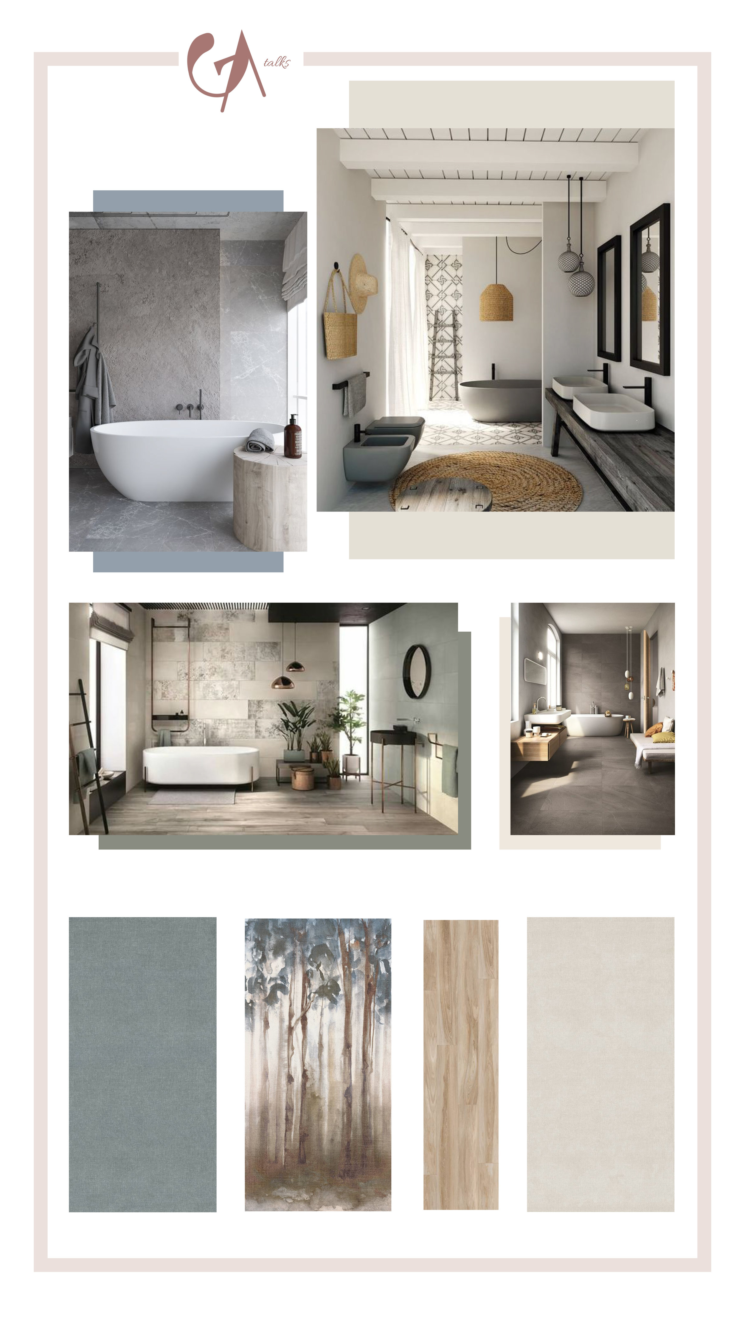
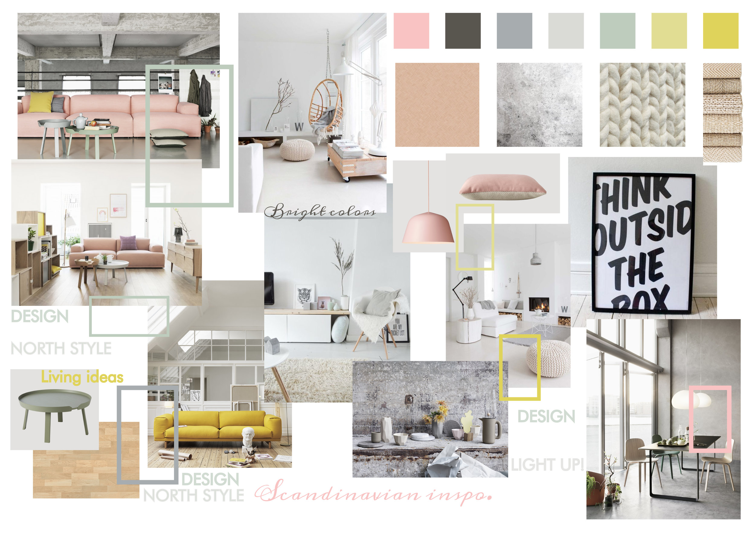
For this interview, Annamaria will share a few of her mood boards, she will talk about her rendering process and more!
Annamaria, in a few words, please tell us a little bit about yourself and your work.
I’m a young architect from Naples, South Italy. I graduated 4 years ago and since then, I started working and experimenting at my job. I love swimming, travelling, watching movies and I’m a Marvel lover.
Your images almost look like real photographs! How do you achieve this level of detail and perfect lighting? What tools do you use?
Well, thank you! I’ve learnt everything studying by myself. Some years ago, I bought a book about Vray and this was my starting point; since then, I’ve practised a lot. I’ve watched and still watch a lot of tutorials to improve my technique. The tools I use the most are 3dsMax, Vray and Photoshop.
Do you think that being from Italy has impacted your work somehow? Are there any unique characteristics of Italian architecture or unique trends that is represented in your work? If so, could you tell us how?
Yes, probably my roots have influenced my work somehow. I tend to observe my city a lot , its architecture and its landscape. Naples is a city with a lot of faces, it gives you a lot of inspiration just walking through its narrow streets. I’ve always loved walking through Spaccanapoli early morning, it always fascinated me the way light impacted the facades of various buildings. But there are also lots of beautiful Italian buildings or churches I’ve studied or seen that have influenced my work. You can see a bunch of pictures that influenced my work on my Instagram @annamgiu.
What influences your work graphically? Where do you seek inspiration to create your images?
When I have to find inspiration, social media has a big impact for sure. The ones I use the most are Pinterest and Instagram. But I must admit, that social media is useful because it lets you access a big amount of pictures and projects in a very little time; but I prefer the ‘old’ way: the direct observation of something. I love walking through my city and taking pictures of whatever I see that can inspire something new, it could be anything: a church, a square, a shop, a window or a detail I find just walking.
What do you take into consideration when composing your images? How do you select the color pallete, the camera angle, lighting, etc? What influences these decisions?
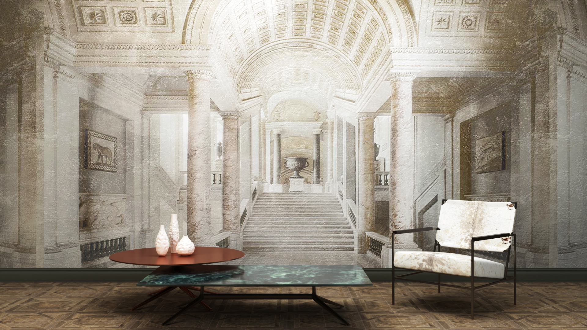
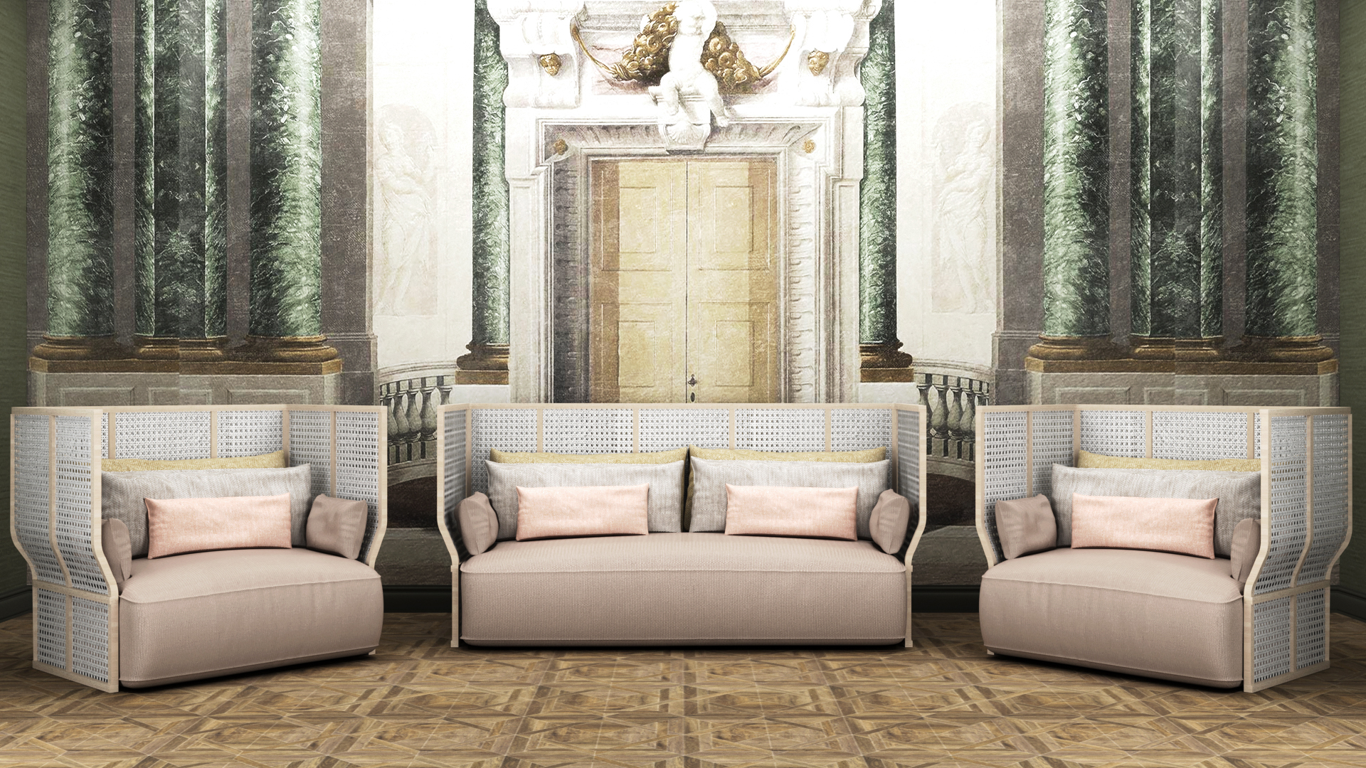
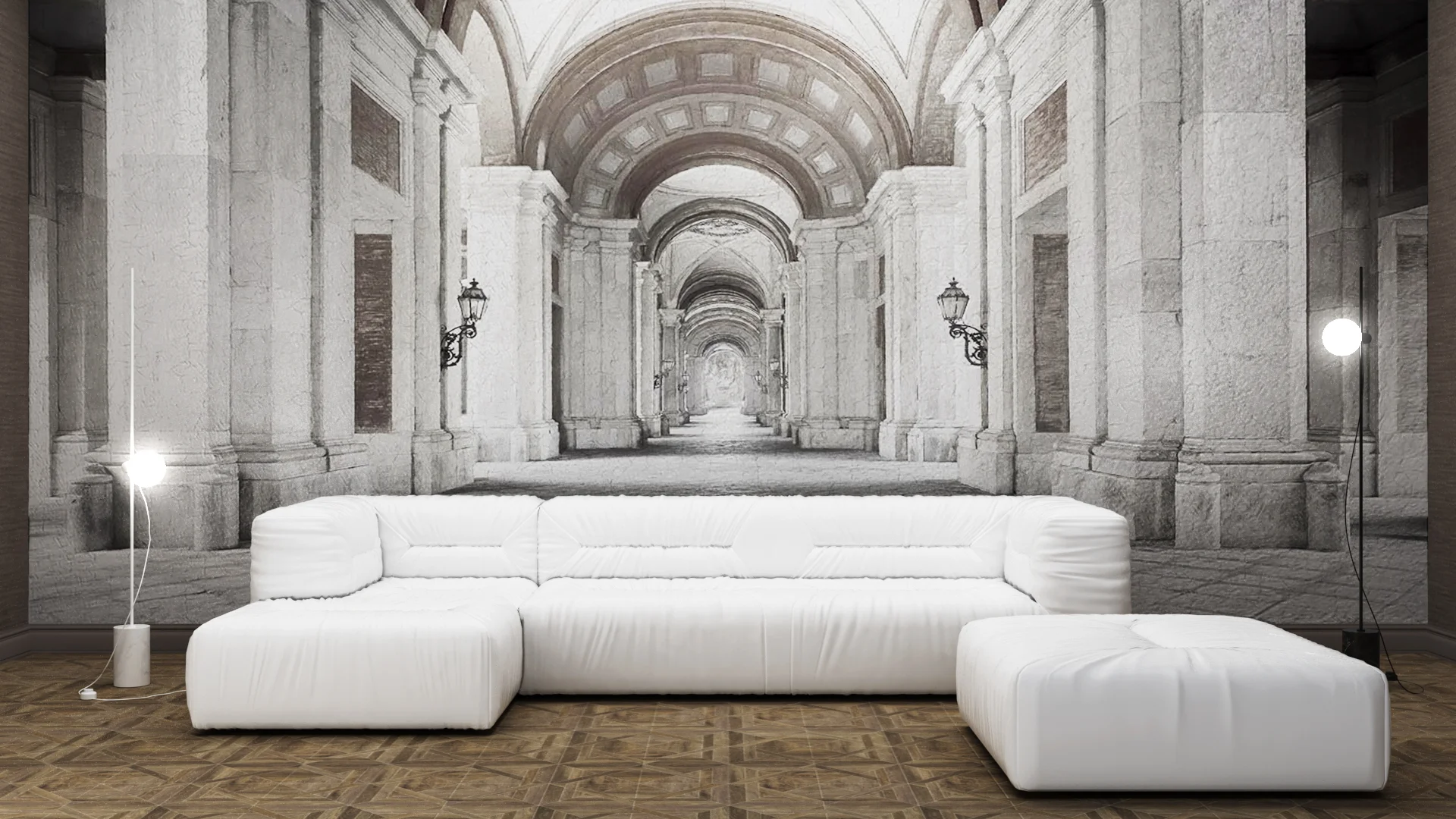
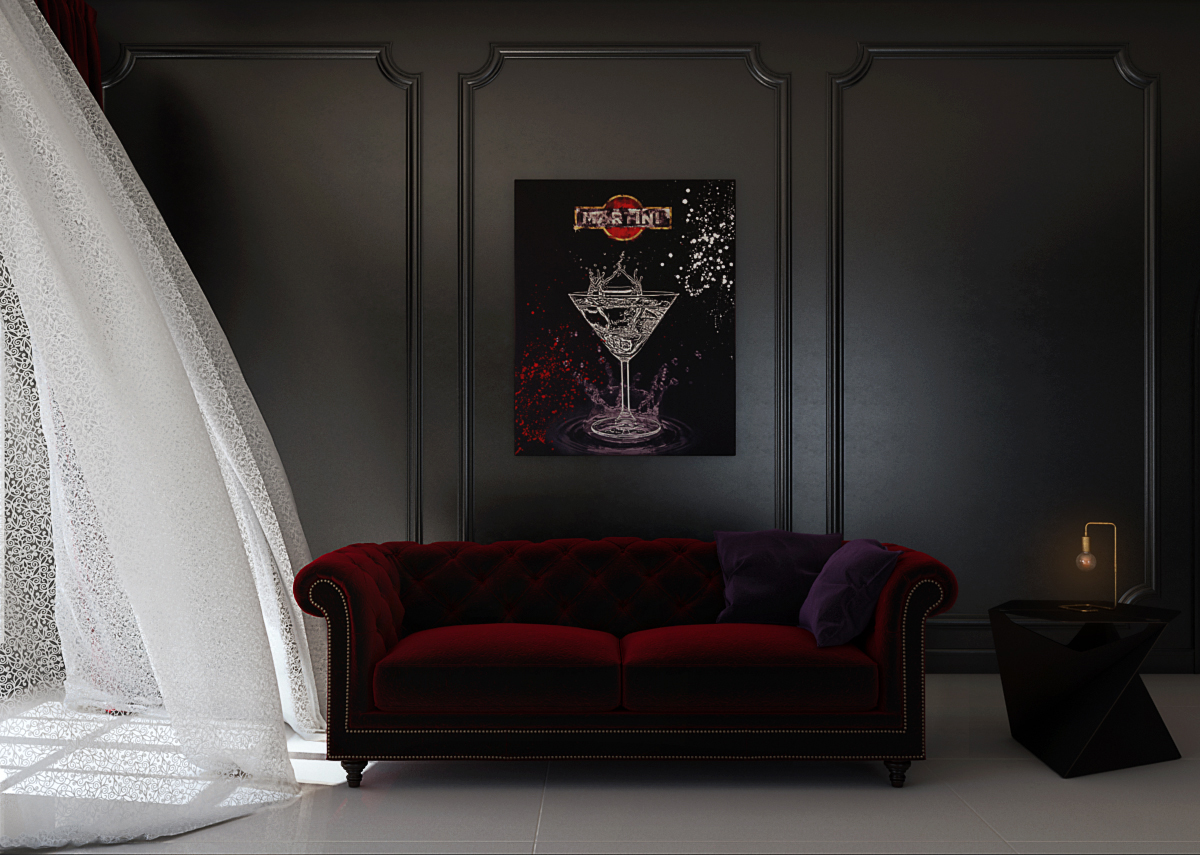
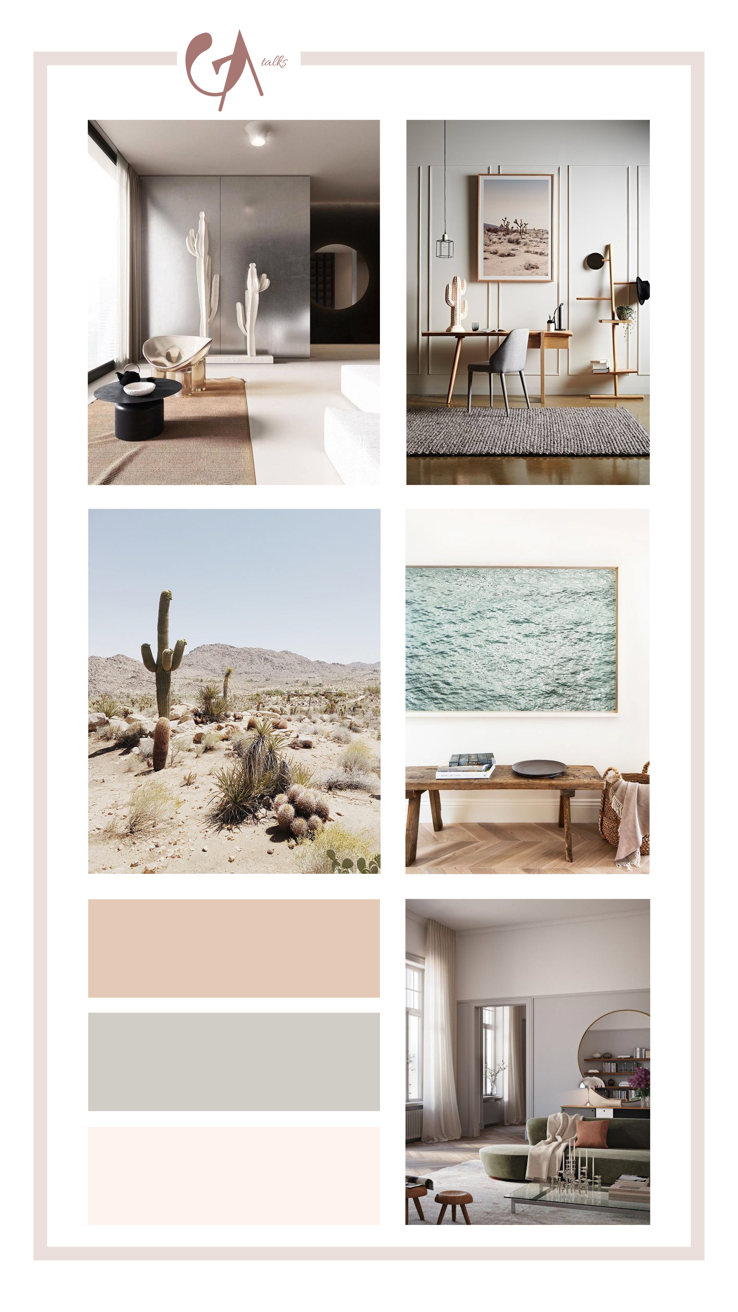
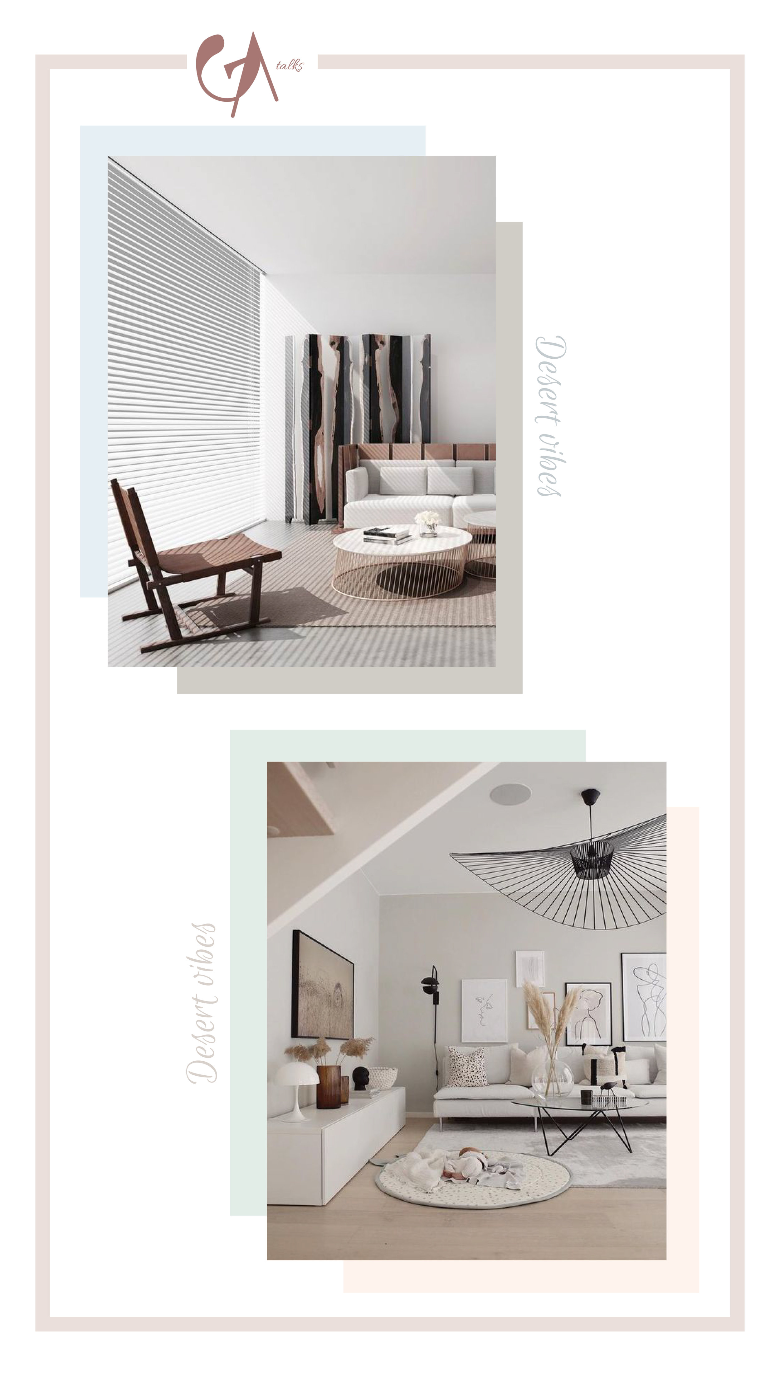
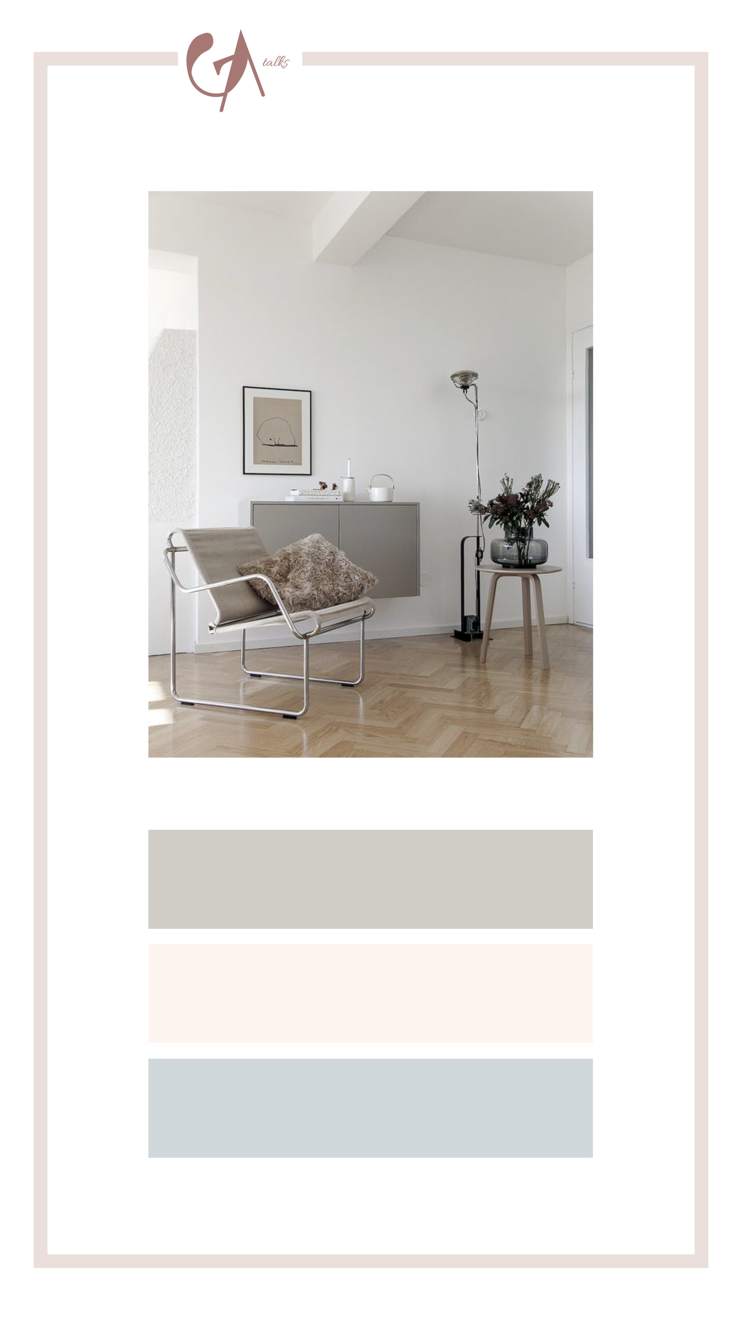
Before composing a new image I start with creating a mood board. Each mood board always starts with an image that impresses me. Then, I start researching pictures, fonts, pattern and I start creating a colour palette that fits that particular mood I created. Mood boards are my guidelines during the next phases, they help me during the modelling, lighting and texturing phases. After the modelling phase, I choose the camera angle, I usually prefer a central perspective (like the pictures ‘How to style a wallpaper.’, where my intent was to focus on the wallpapers and show how to style them) but sometimes I use the rule of thirds. Lighting is also influenced by the mood board, for example, if I’ve chosen dark colours, velvet material or some particular lamp (like the picture 'A medium dry martini, lemon peel. shaken not stirred.' - yeah I know I have a thing with finding cool name for my project!-), the final picture will be a dark one, which just some lights highlighting some details.
Could you show us / talk about the process to create one of your images? Do you use the same process for all your images?
Yes, sure! I must admit that I don’t always use the same process for all my images. If I have to create an image for other architects usually everything is laid down (colours, texture, camera). But if I have to create an image for a work of mine, I start to project everything in 2D with plans, sections, elevations - they allow me to have certain technical control of the project (dimensions, propositions…). Then, I create a mood board that allows me to define a ‘style’. After these, I start modelling, I create the 3d version of the project, I insert every detail and choose the camera, I adjust something and create the lighting, do some test and finally start with the texturing phase. I do some other tests before launching the final render. When the final render is done, I do some post production with Photoshop - it helps me to increase the realism of the image.
What are the biggest challenges when creating your work and how do you work with them?
When I create something new I always try to create something that I like and that could be also loved by a wide public. I don’t pretend my work will be loved by everyone, but I try to differentiate them - I always try to experiment with new colours, new styles and new patterns to bring something new because I consider my projects a visual experience.
What advice has influenced you as an architect?
Once a professor said to me: ‘don’t be in a hurry!’, - he was right! Architecture has its timing and you have to respect it. You can’t pretend to project something in a few hours. You have to think, to study, to sketch, to observe and to make changes to your designs - this is how you improve your work.
“Architecture has its timing and you have to respect it. ”
What advice would you give to young designers?
Experiment! Don’t be afraid of doing this, experiment with shapes, styles, colours… this is the only way to learn and create your own style. Observe the world around you and find inspiration in it.
I want to thank you for this opportunity, it has been an honour for me! I found this interview very useful - it let me talk about a lot of themes you don’t find easily on social media. I try to do something similar in my little space on Instagram. It’s important to share news, tips, useful information about architecture and design and give spaces to interesting designers that don’t have big numbers!
“Experiment! ”
Annamaria, thank you for taking the time to interview with Arch-Vizz and talk about your beautiful work.
You can find more about Annamaria Giugliano's work at on her instagram @annamgiu.
Interview & Images Courtesy: Annamaria Giugliano
Interviewer: Stefani Fachini
